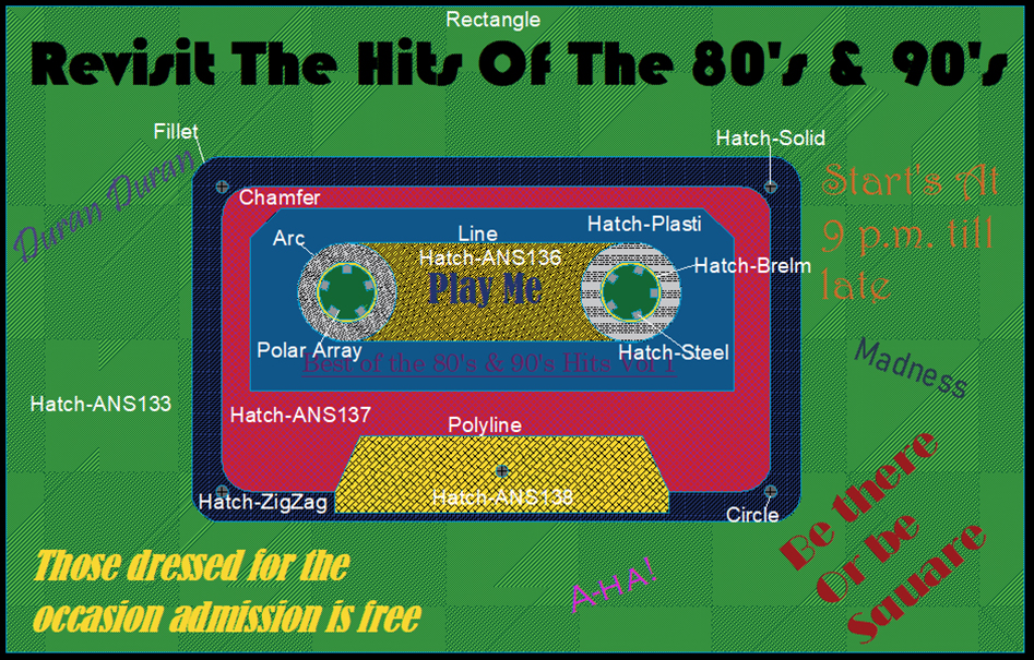
This exercise involved designing and producing a poster or an artistic scene using technical drawing graphical styles.
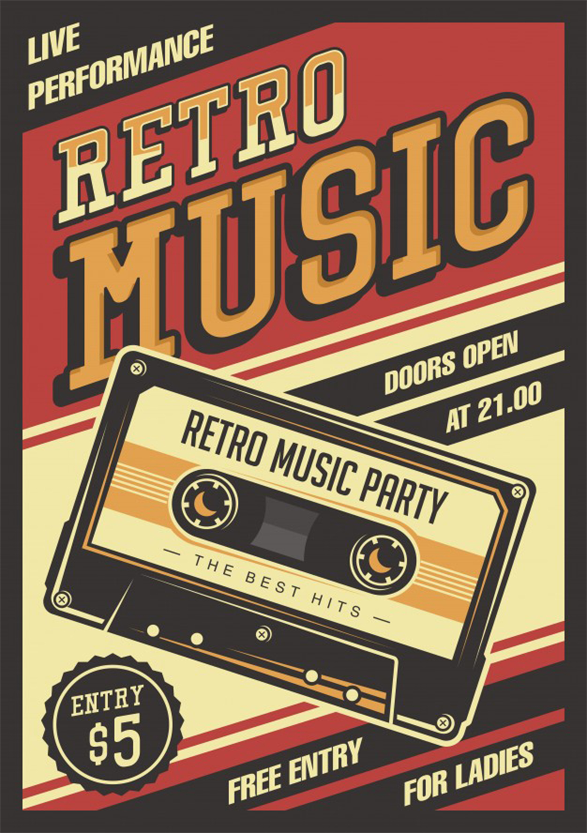
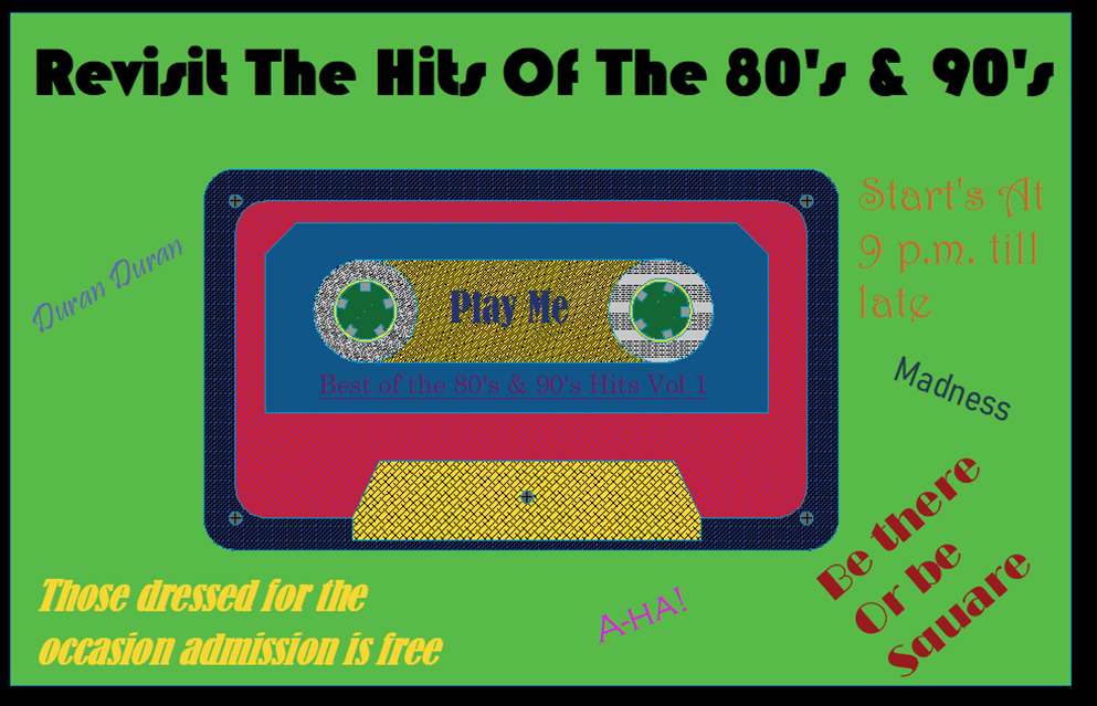
I had no initial ideas for this at first however, I used the pinterest board as I did in Exercise 1 to help come up with poster design ideas. From this I chose a cassette tape design to use to promote retro music.
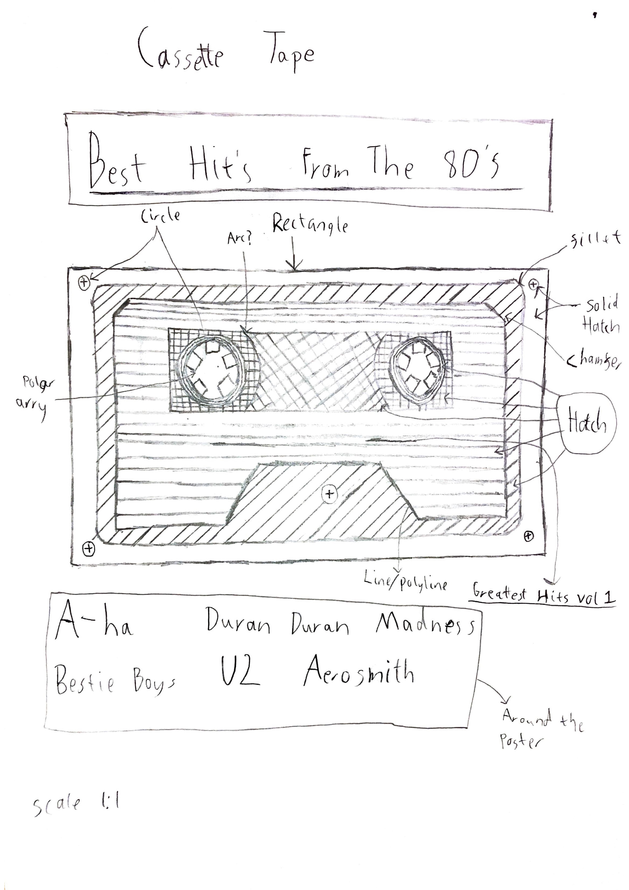
Once I decided on the poster I then proceeded to make a sketch to show how I would like my design to look with pointers showing what should be on the poster.
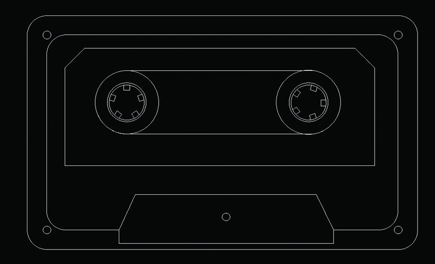
Once the sketch was finished, I started on my design using AutoCAD. Some aspects were changed during this stage in an attempt to show my range of design skills.
To give this more of an album look I then added a rectanglur border. From the feedback I recevied I then added layers to the design to show the diffence between the background and the model.
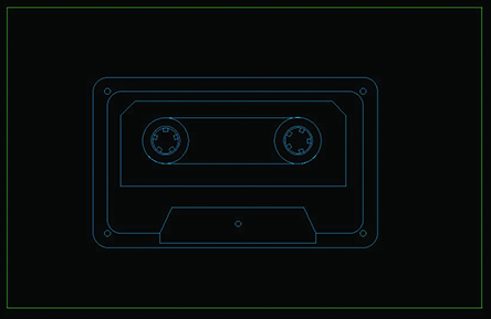
Once the design was finished I then began to incorporate my hatch ideas. Once I was happy with these I then added colours which I believe mimicked those of the 80's and 90's.
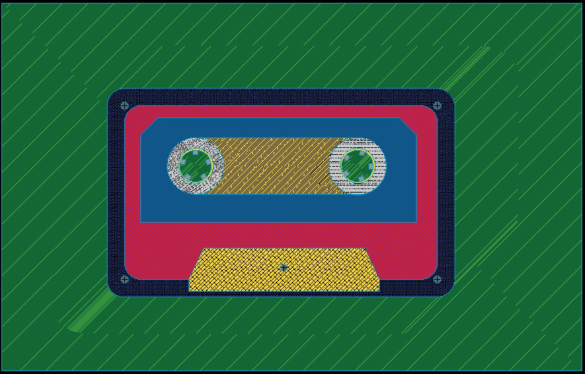
The following are a couple of close-up screenshots of the model.
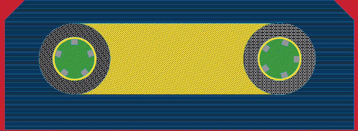
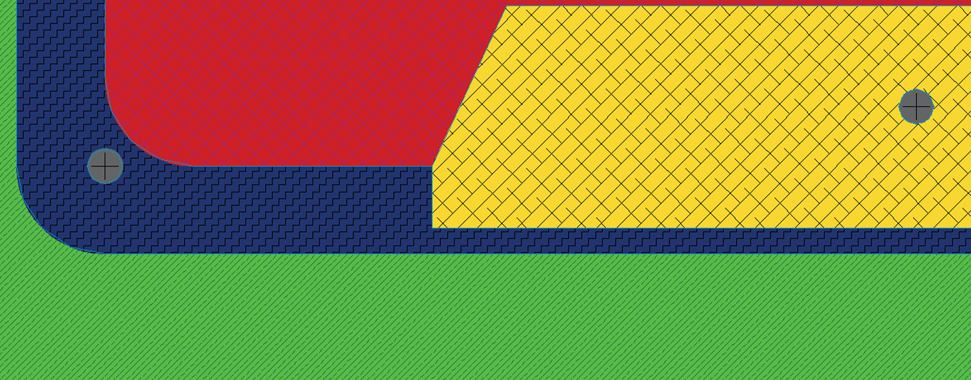
Once the hatches, colours and patterns were completed the final part was to include the text. I first added the title of the poster, I then added the bands using different fonts and rotatings to give it an artistic look. Some of the wording I have used was inspired based on the posters I found on Pinterest such as "Play Me" and "Best Hits Vol 1".
The image below details the different tools and hatches I used in creating this poster.
