For this exercise I had to choose an everyday item that we use and then explain how we would ergonomically improve it and why.
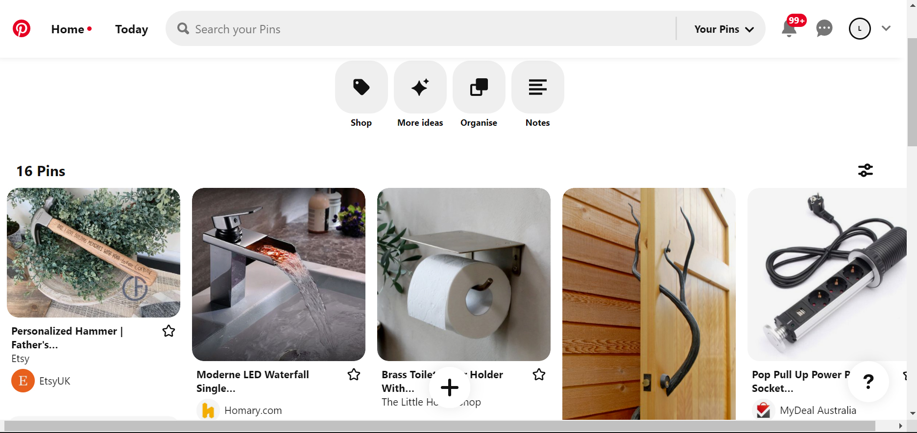
To begin this exercise I started looking at items that I have found difficult or frustrating to use. I used Pinterest to help with finding relevant pictures.
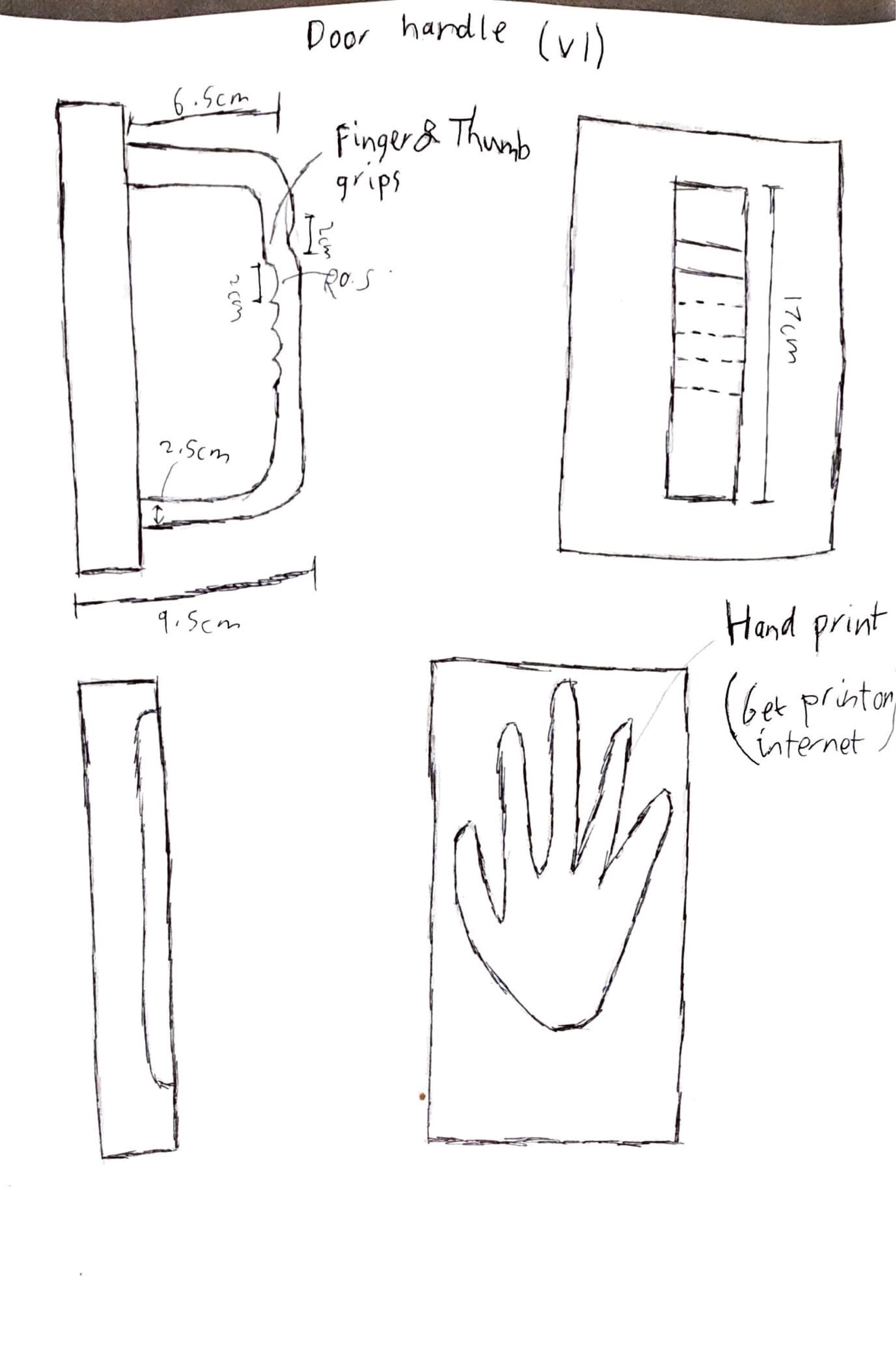
My initial idea was to design a new push and pull handle. This was to incorporate a hand print in the push and the use of finger grips that would indicate the pull. After attempting the initial design, I found that this would not be as beneficial as I first thought and decide to look for an alternative.
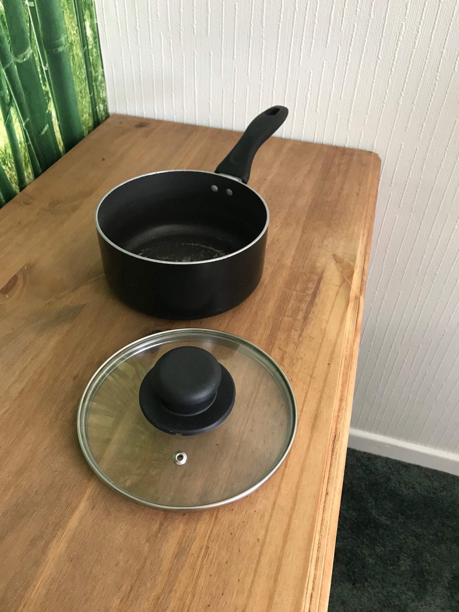
Having watched my parents cooking meals, I noticed the constant need to keep removing saucepan lids to check on the food. This meant having to find somewhere to leave the lid while they where doing this and often there was very little room for this to be done. Based on this I have designed a solution which I believe could help with this.
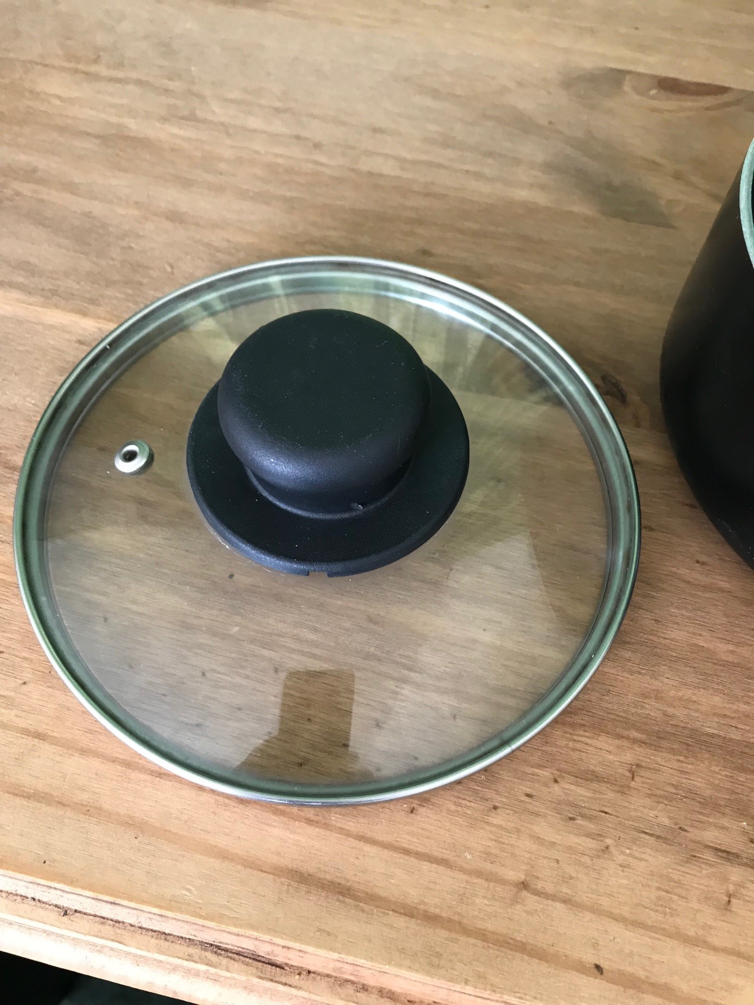
The design is based around a solid stainless steel ring which sits on top of the saucepan. This then has a glass lid which is in two halves and which are attached to the ring using small stainless steel hinges. The concept of this being that you can lift one or both halves of the lid to enable you to check on the food, reducing the need to take the lid off and removing the need of finding somewhere to leave it.
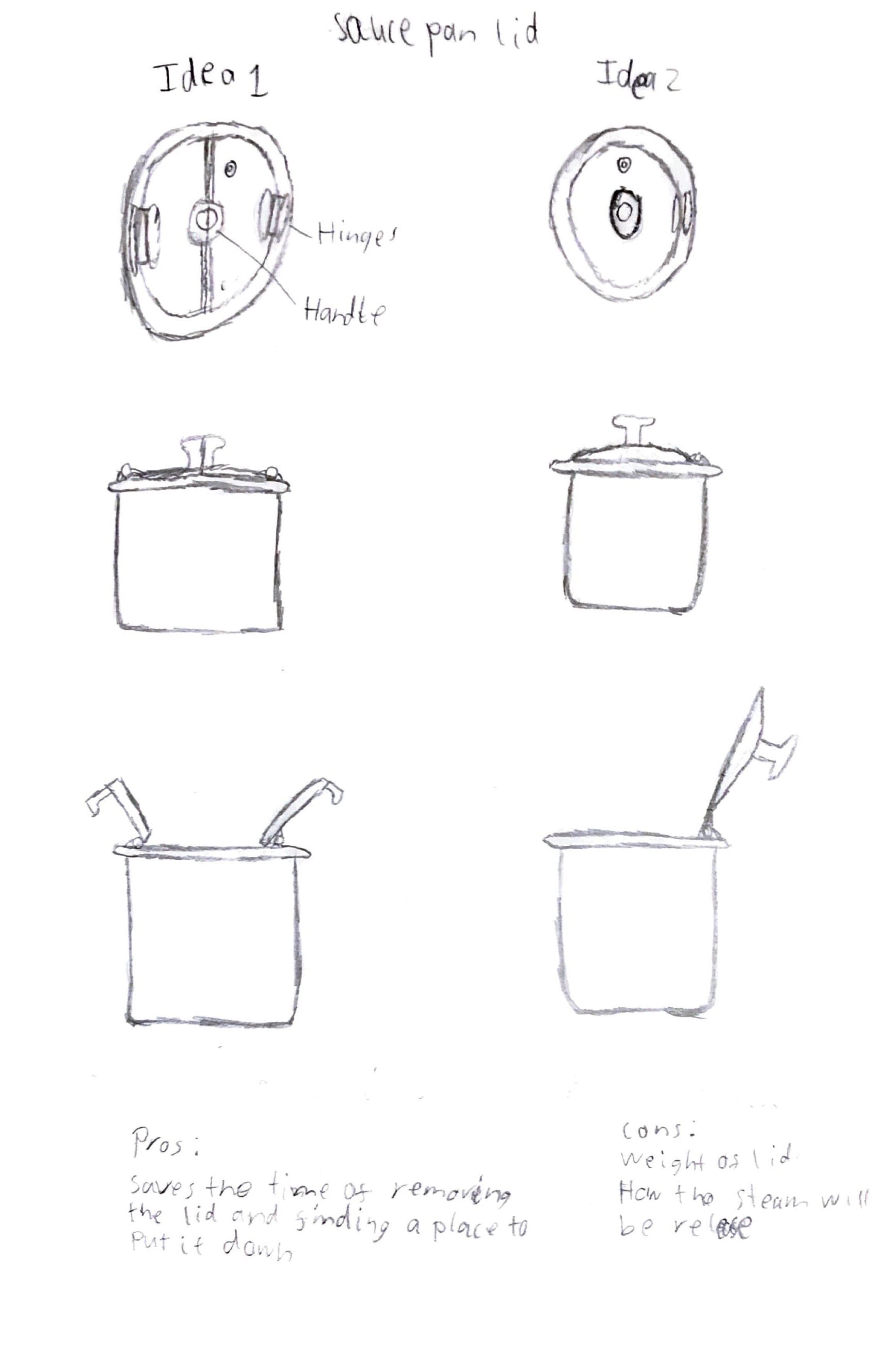
Under my initial design, I was going to make the model, which would have had a lid securely attached to the saucepan. The design of the lid would have remained the same.
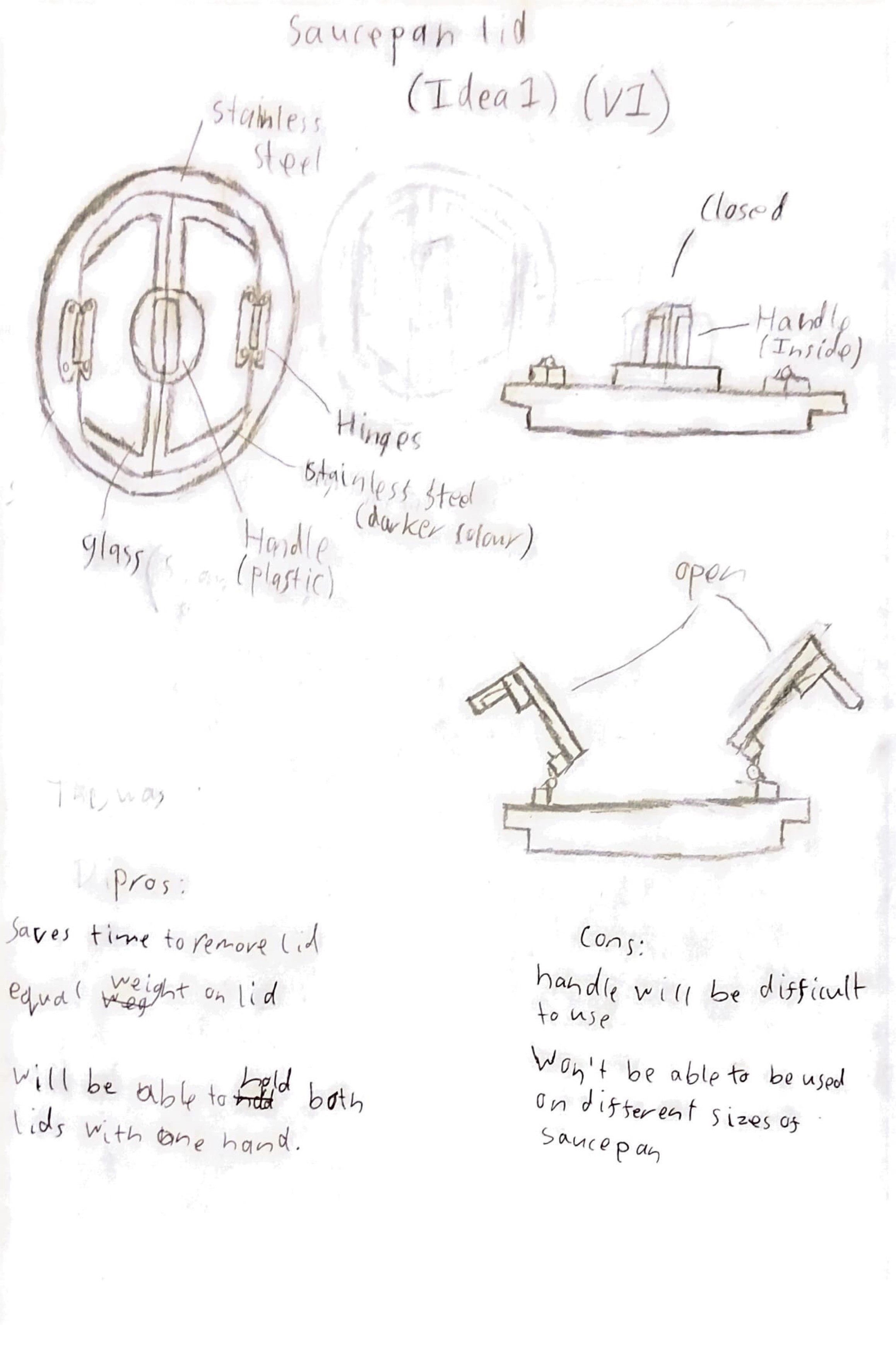
The draw back to this option was the initial cost for producing it and also the fact that the buyer would have to pay to replace their existing saucepans. To get around this I decided to just create the lid, reducing production costs and also costs to the buyer as the design would fit their existing items.
To make the model I created a 2D design to show the piece in different elevations and also the dimensions for each part.
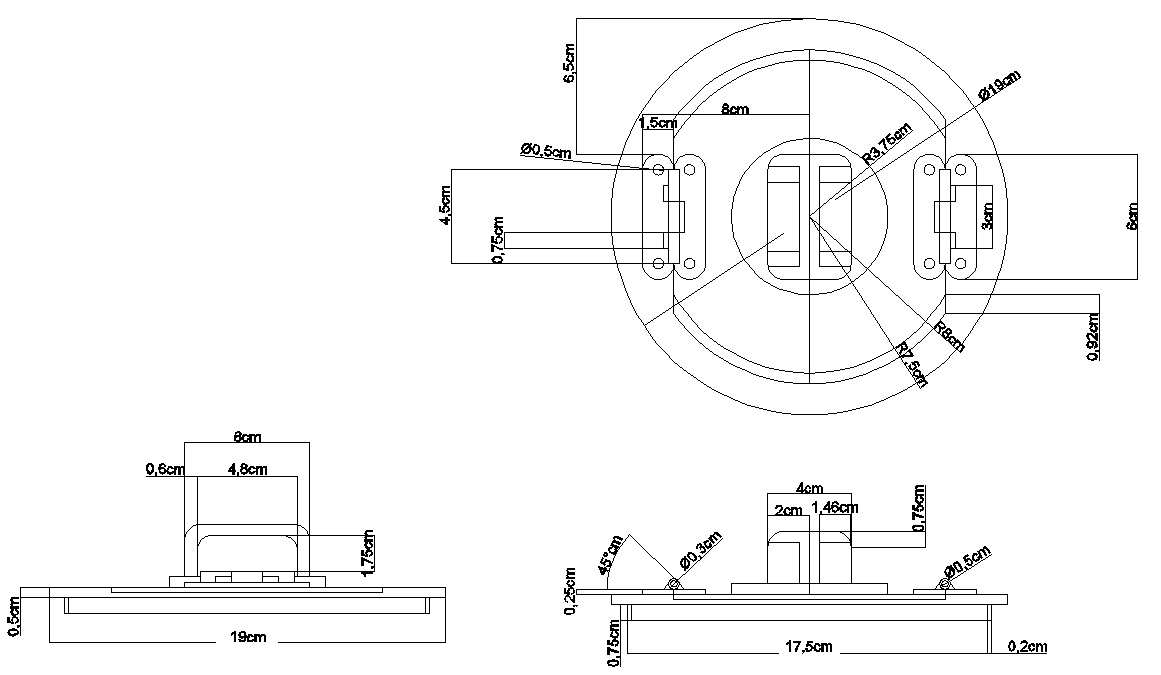
After making the 2D design I created the 3D model and then rendered the piece using the materials I wanted to use as seen in figure.1.
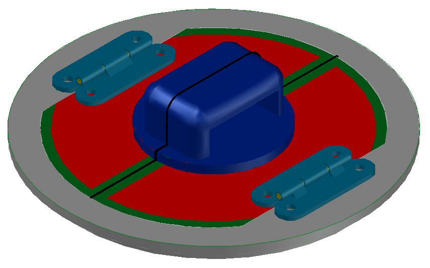
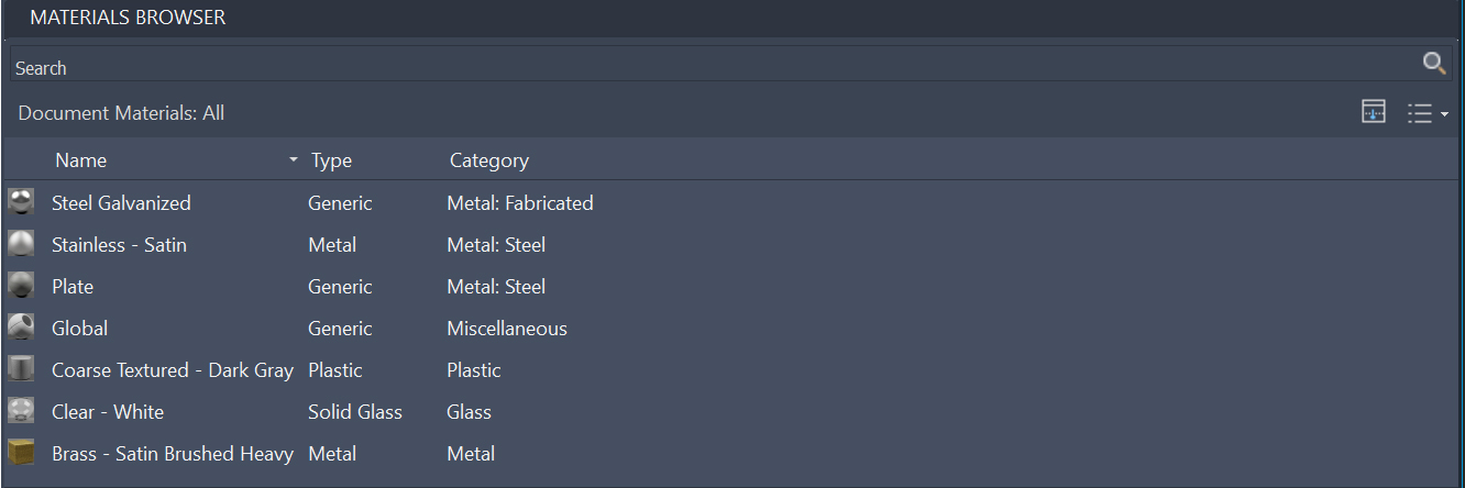
fig.1 - Materials Browser
Figures 2 to 5 show the final look of the model.
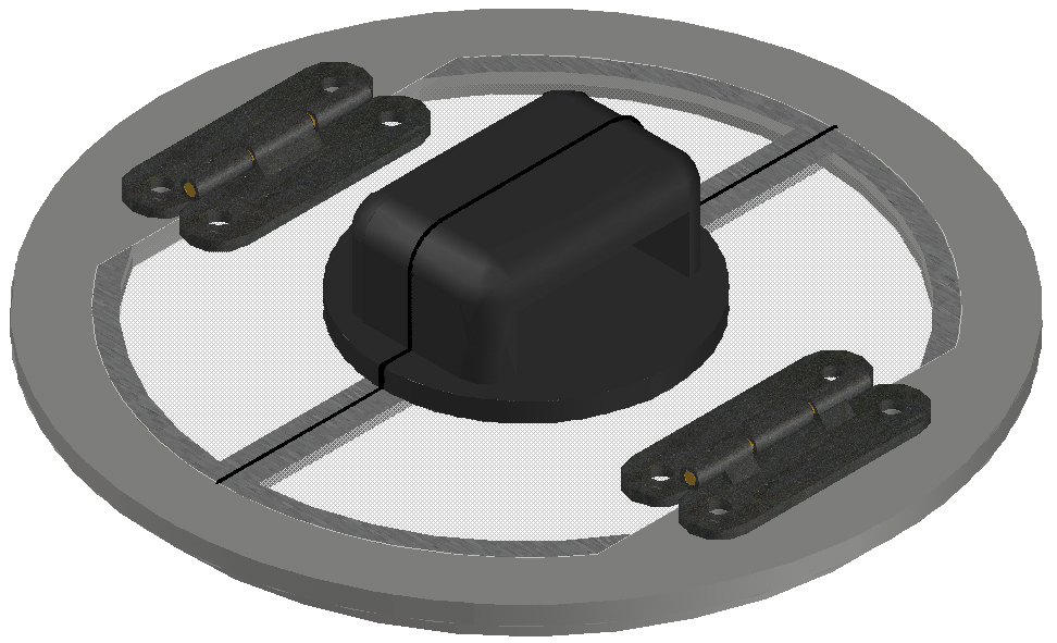
fig.2 - Corner View
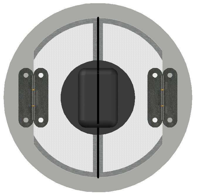
fig.3 - Top View

fig.4 - Side View

fig.5 - Front View
The following are a couple of animations I have created to show the lid:
Improvements I have considered are, a change in handle design to improve how the lid locks, along with adding a number of holes along one half of the lid to act as a strainer which would then reduce the need for a colander.