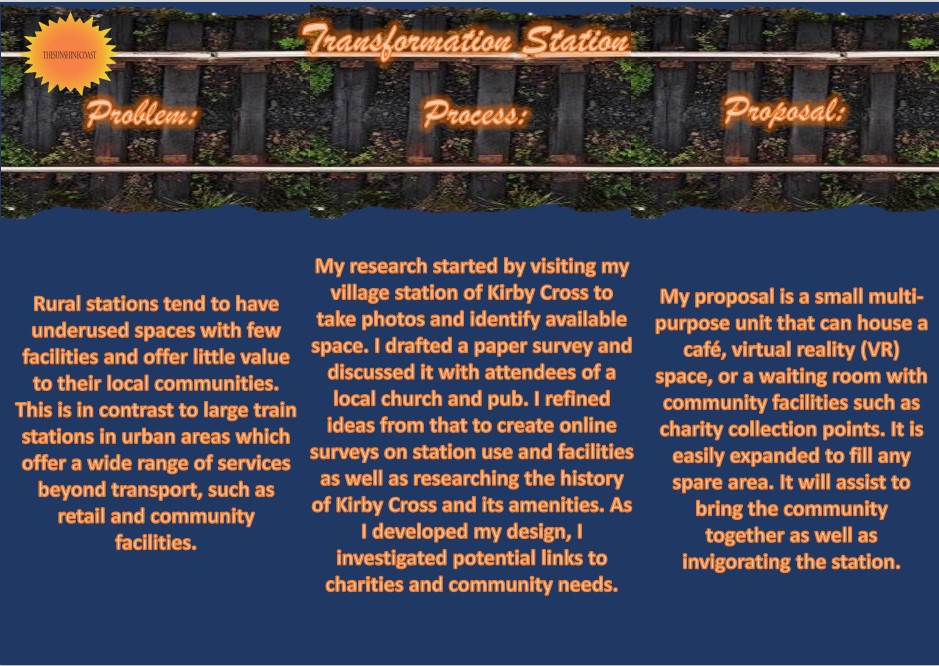
1. Background
The Royal Society of Arts (RSA) provide briefs on a range of topics from which I selected "Transformation Station" for my individual project. This poses the question "How might we leverage unrealised spaces in small transport hubs, as catalysts for communities and places to thrive?". Network Rail have sponsored this brief. This I found the most interesting out of all the briefs as it open to interpretation on how to use space on any rural station of my choice. The location of the station I decided to focus on is Kirby Cross, a village in the Tendring district of Essex. This is because it is my home village, in a semi-rural area and as a previously frequent user of the station, I believe that it could offer more for the community. My observations in the past were that it could be improved with either more shelter from the weather or through offering refreshments, so this brief plays into what I have been thinking for the station.
2. Research on the local area
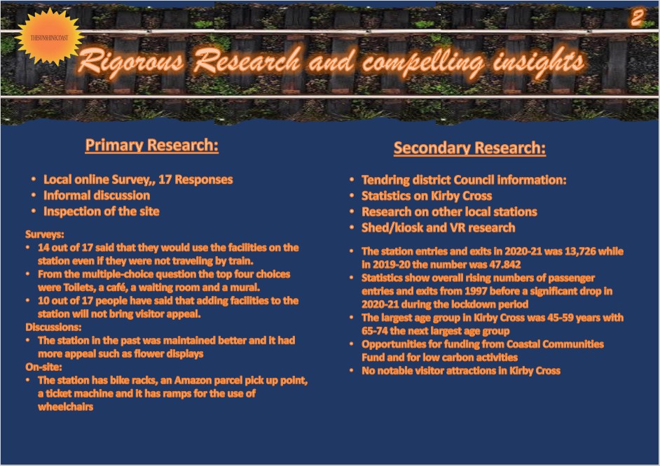
Kirby Cross station is the 3rd station away from the Essex coast on a branch line dubbed the "Sunshine Coast Line". At the beginning of the project I researched the history and area of the village of Kirby Cross. This provided more detail on Kirby Cross village itself, its population, age demographic, and amenities.
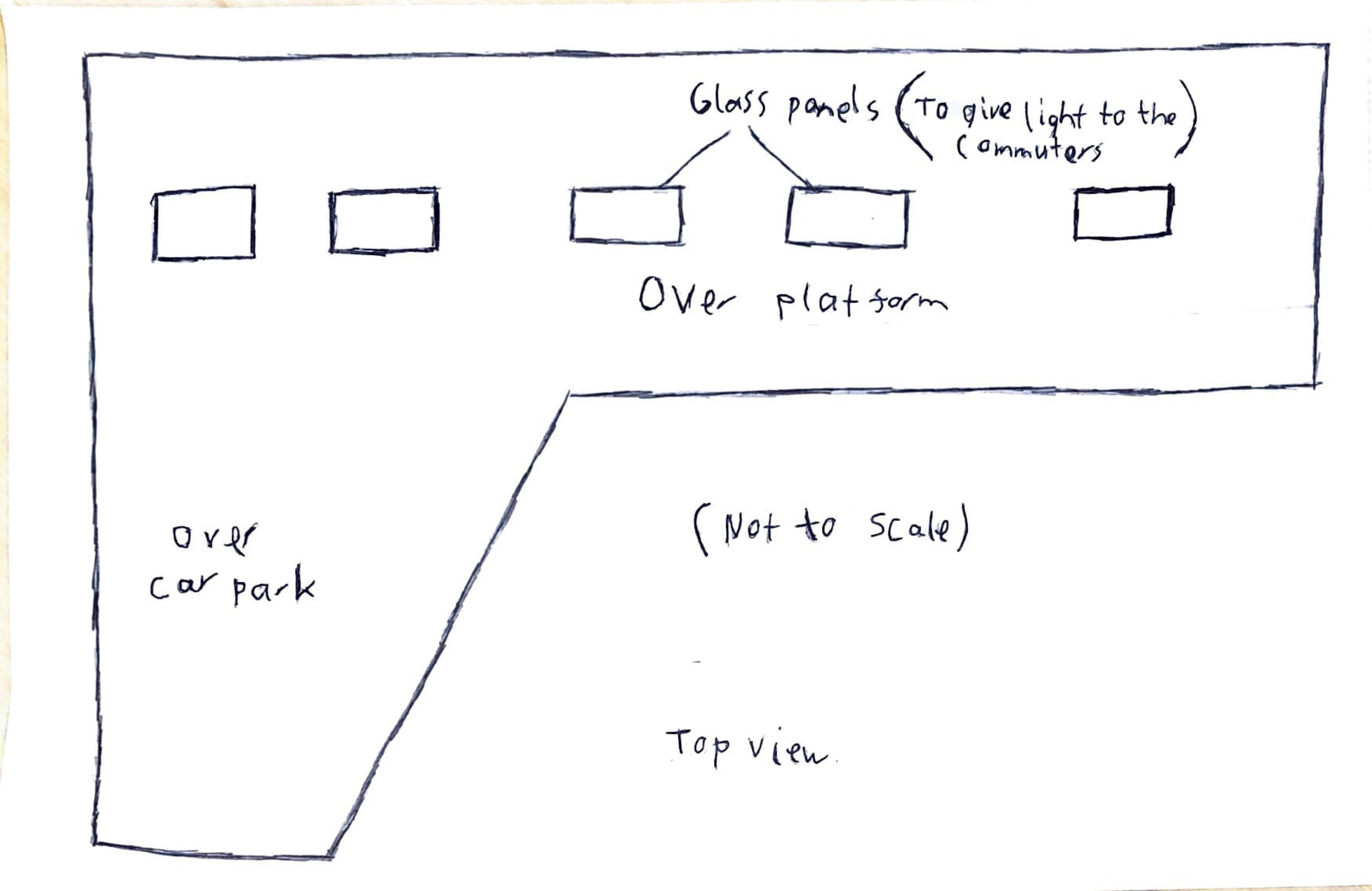
While I was thinking of what I wanted for the brief, I started sketching what I wanted to place on the station itself. After talking with my father about my ideas I decided on a park as its roof, with stairs that will lead to the top. It would also be connected to both platforms and would remove the need to cross the tracks.
Office of Rail and Road website showed that 2020-21 the entries and exits at this station were 13,726 while 2019-20 was 47,842 (figure 1.1). The same measure for passenger numbers for Kirby Cross from 2006-07 to 19-20 fell into the range between the 40k to 48k (rounded up) (figure 1.2).
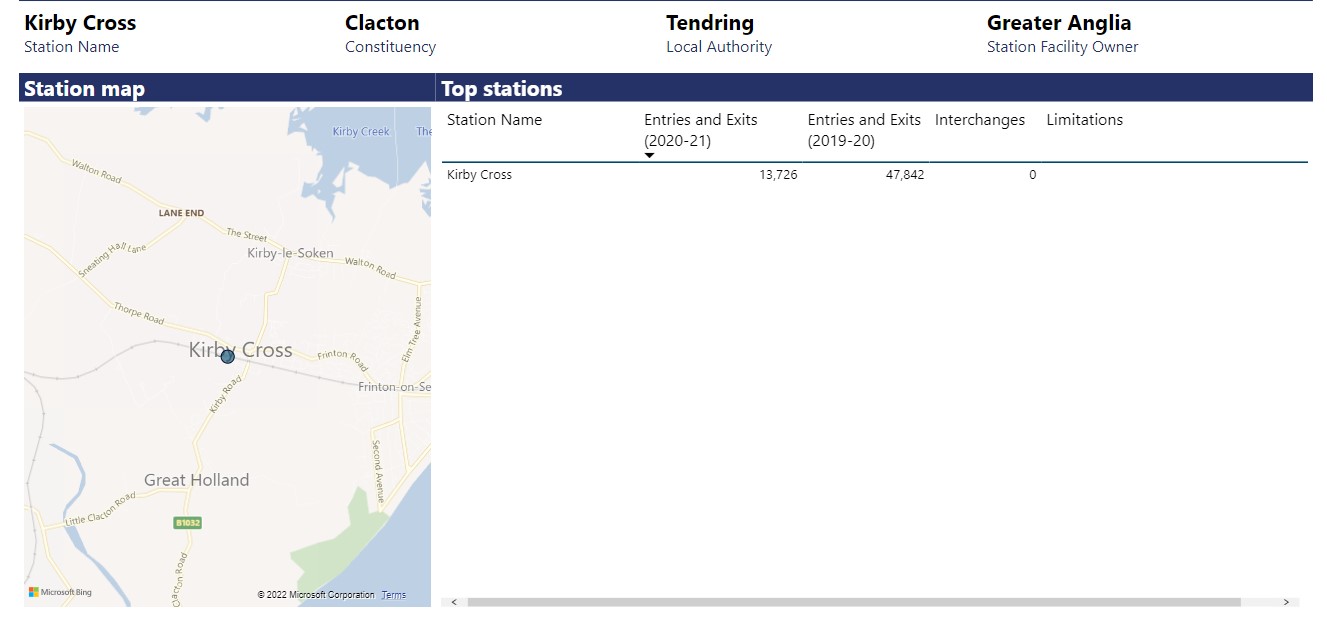
(fig.1.1 - Location of station and recent statistics)
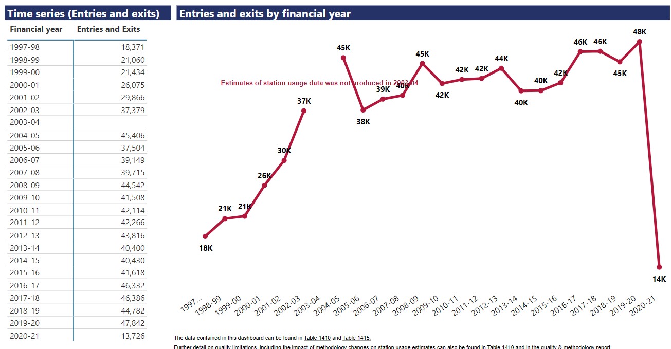
(fig.1.2 - Timeline of entries and exits)
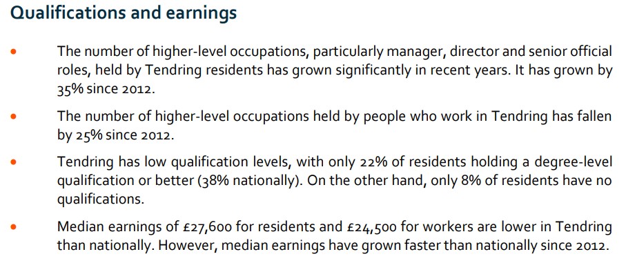
Street Check website (which includes census information and land registry data from official government databases) showed that the age range that is the most common in the area is between 45-59 years, with 65-79 years being second (figure 1.3 and 1.4). Also that the majority of the people living within the CO13 postcode area (which includes Kirby Cross) have no qualifications (figure 1.5).
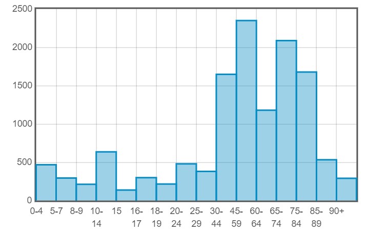
(fig.1.3 - Barchart of age group)
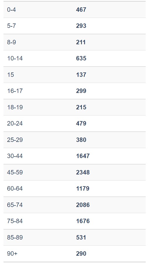
(fig.1.4 - Age group numbers)
(fig.1.5 - Qualifications in the area)
Tendring District Council SWOT:
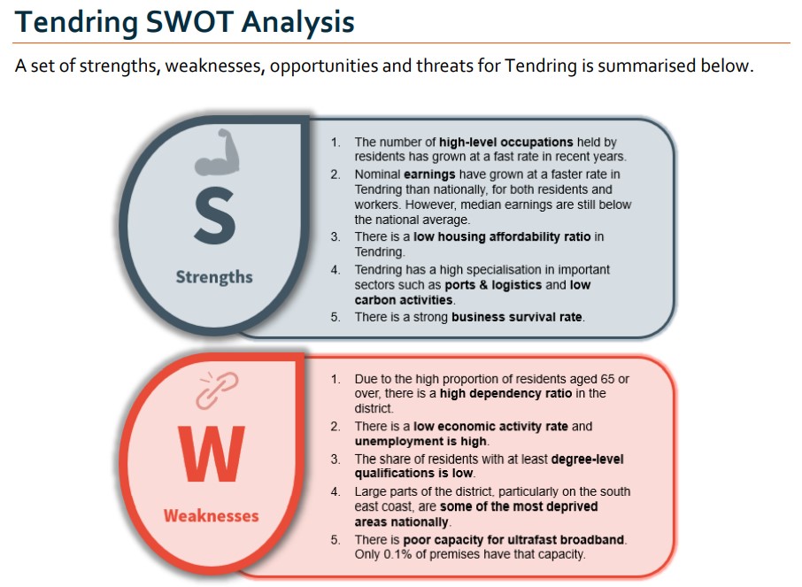
(fig.1.6 - First half of SWOT)
.jpg)
(fig.1.7 - Second half of SWOT)
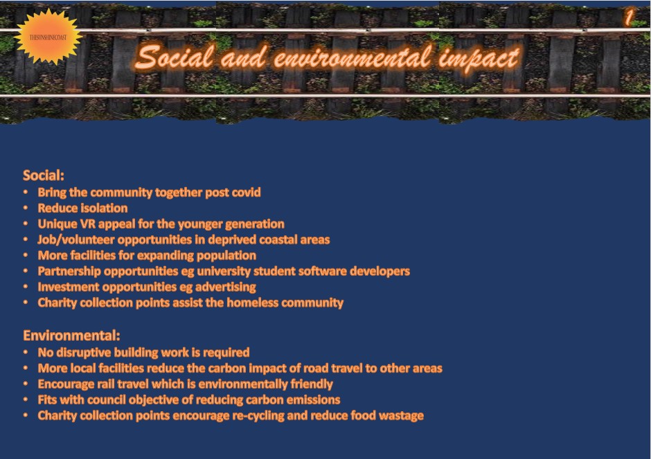
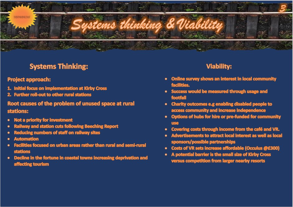
The conclusion from the local area research is that although station use has decreased, this is likely due to the Covid-19 pandemic restrictions. With new housing being added to the village, use will probably return to its previous level or even increase if the station were to offer new facilities. When I conducted the survey (shown in section 4. below, figure 4. ), this indicated that footfall would increase as station facilities would be used even when not travelling. With new families moving to the area, this may change the population dynamic from being predominantly older people. The qualification levels and aspirations may also vary as the population increases, and Kirby Cross station allows convenient access to colleges and Essex University in Colchester. My ideas for design would aim to be cross-generational.
The first and the last opportunity is shown in the opportunites above show possibilities for investment. There is an intention from the local council to use the funding for low carbon projects. Increasing rail use over road transport could be classed as that. Also, there is a reference to investing in coastal areas.
The first action I took was to create a mind map to write down my initial ideas to address the problem of what could be developed to transform the station. This started my design ideas, as well as documenting some local amenities.
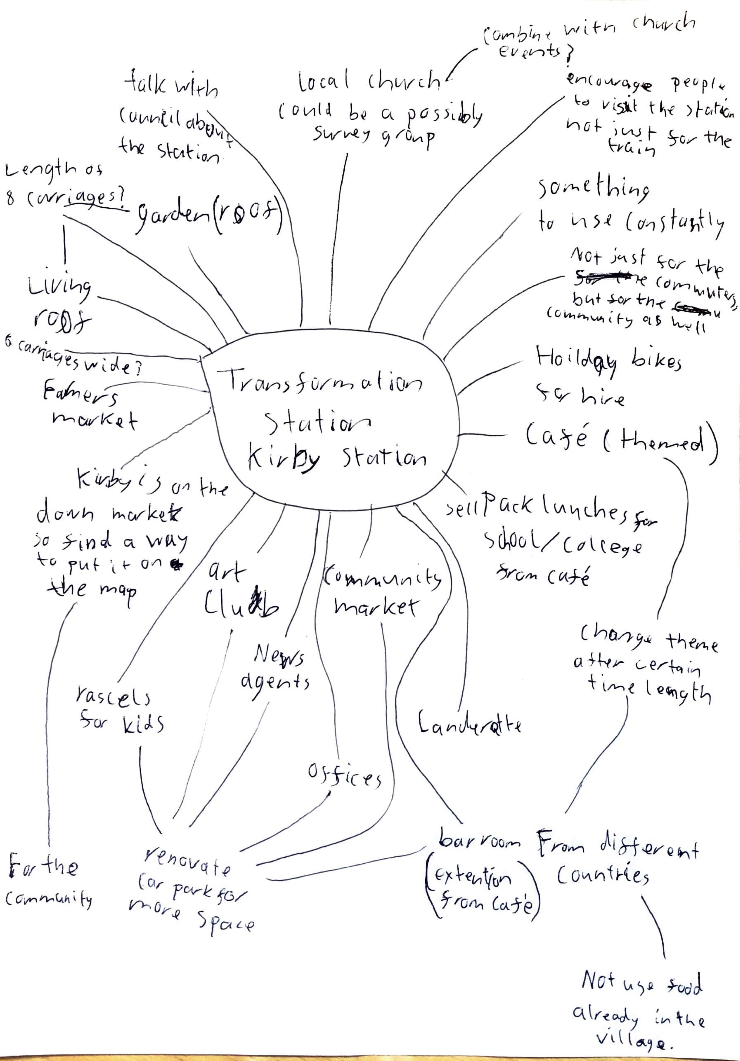
(fig.2.1 - Mind Map)
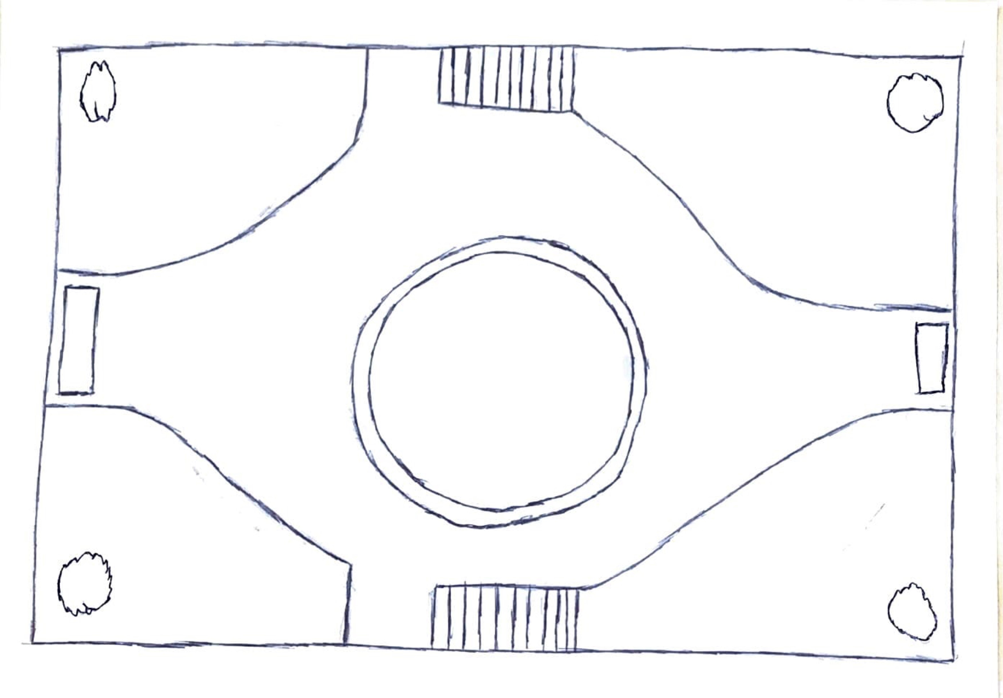
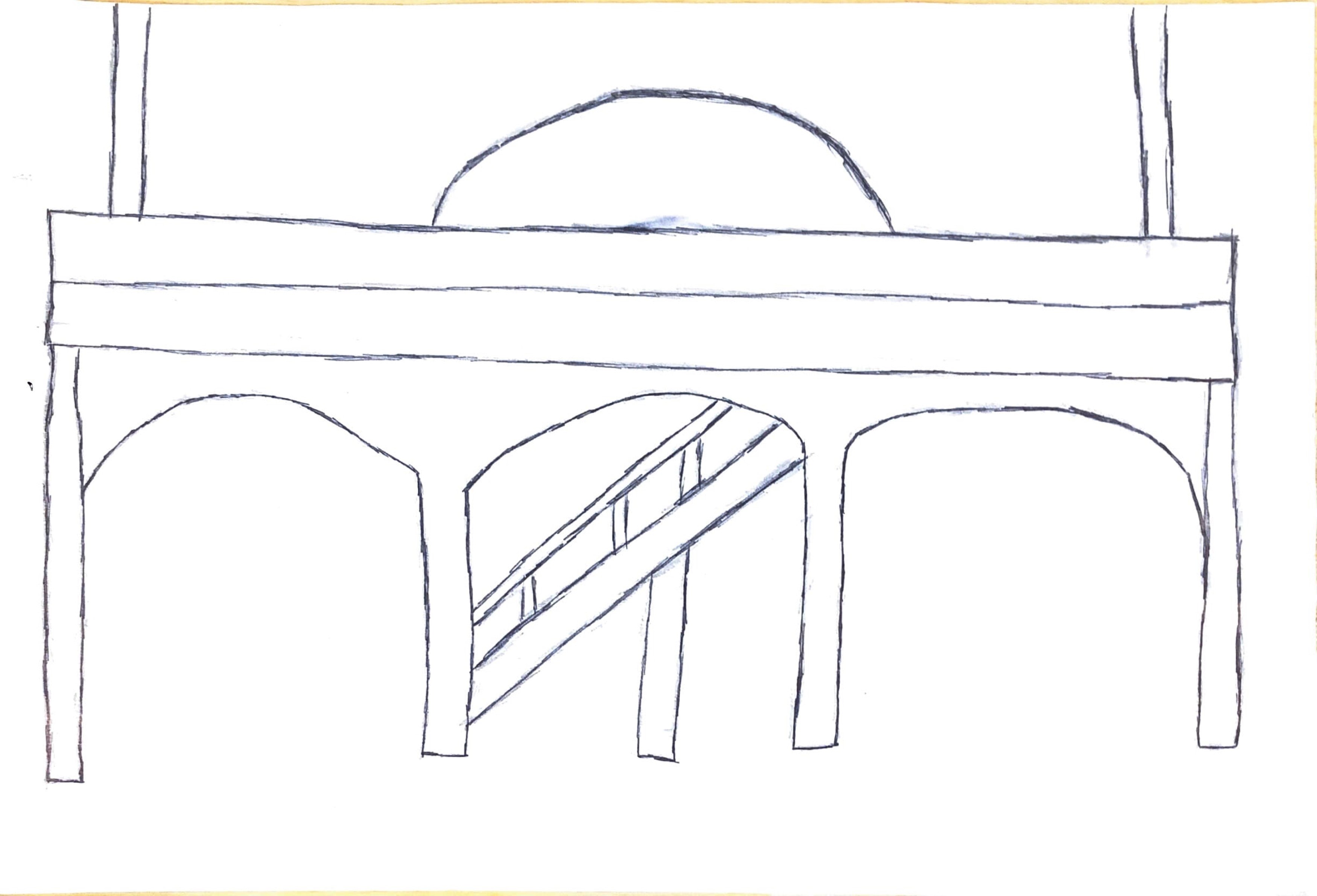
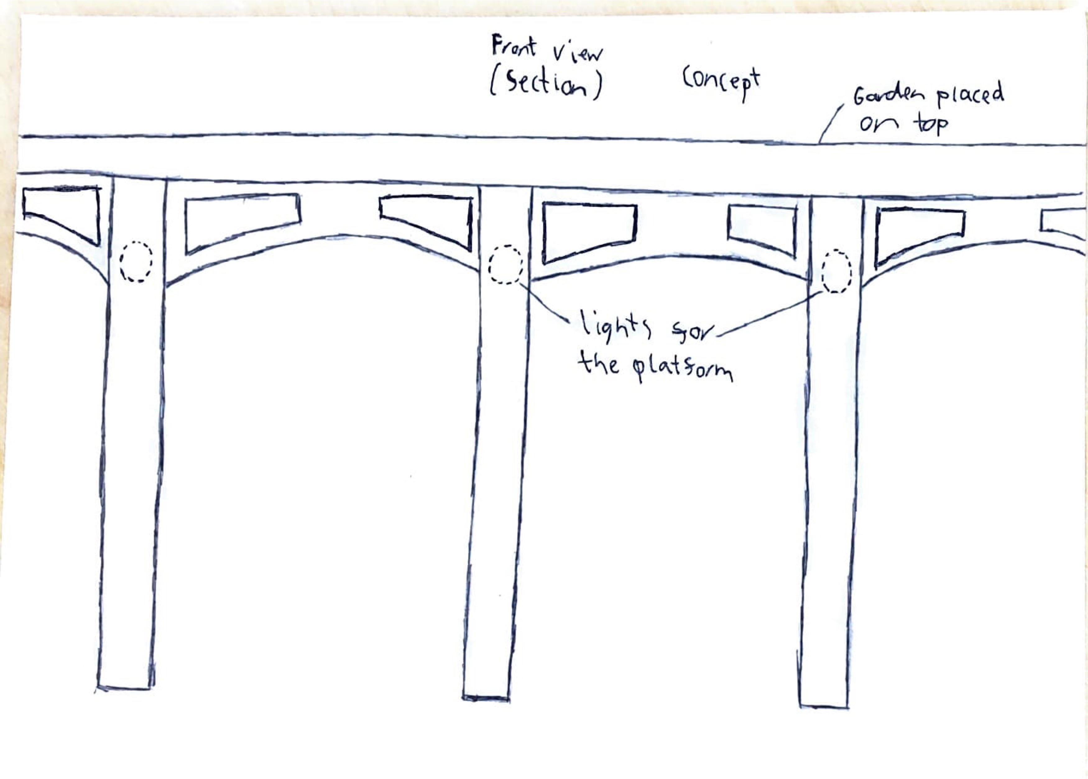
Following the research, I started working on my designs for the station, see the original drawings below. These show the initial idea to have a roof "living" garden over the top that had stairs connecting the platforms. This would mean that passengers would no longer have to cross the railway tracks. There was a plan to construct a building that would connect to the roof as well.
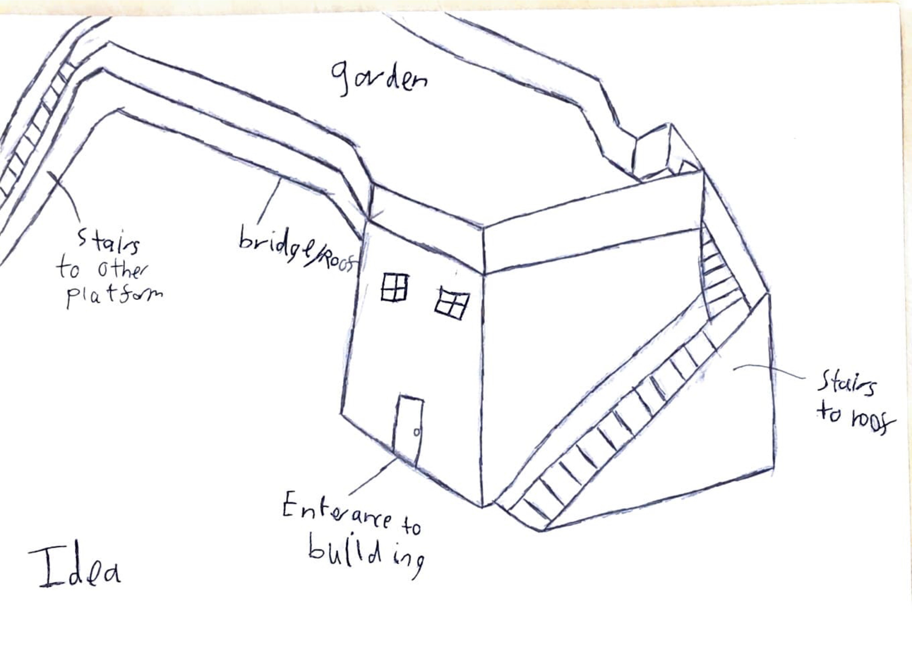
(fig.2.2 - Idea One)
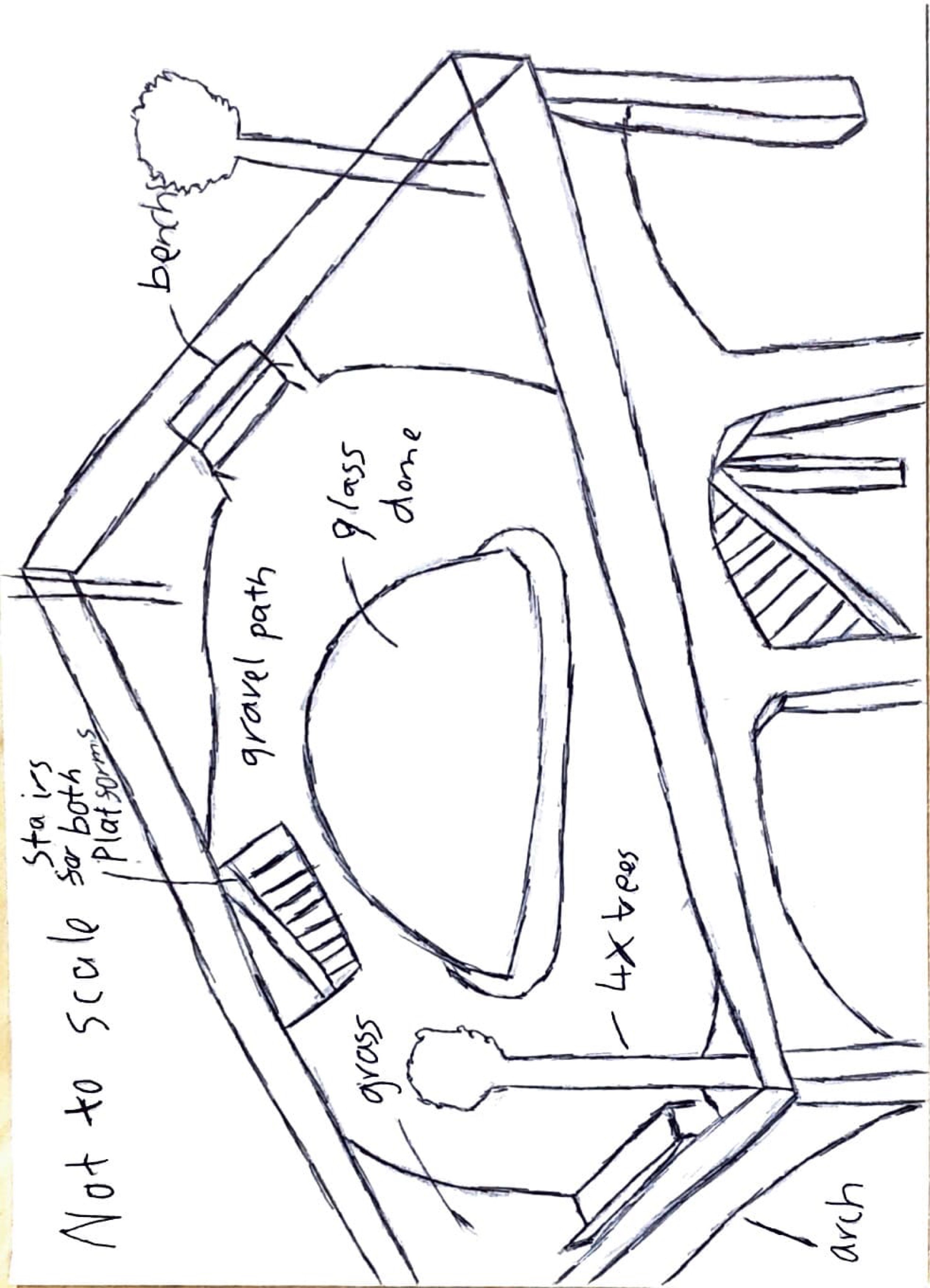
(fig.2.3 - Garden Roof - Corner)
(fig.2.4 - Garden Roof - Top)
(fig.2.5 - Garden Roof - Side)
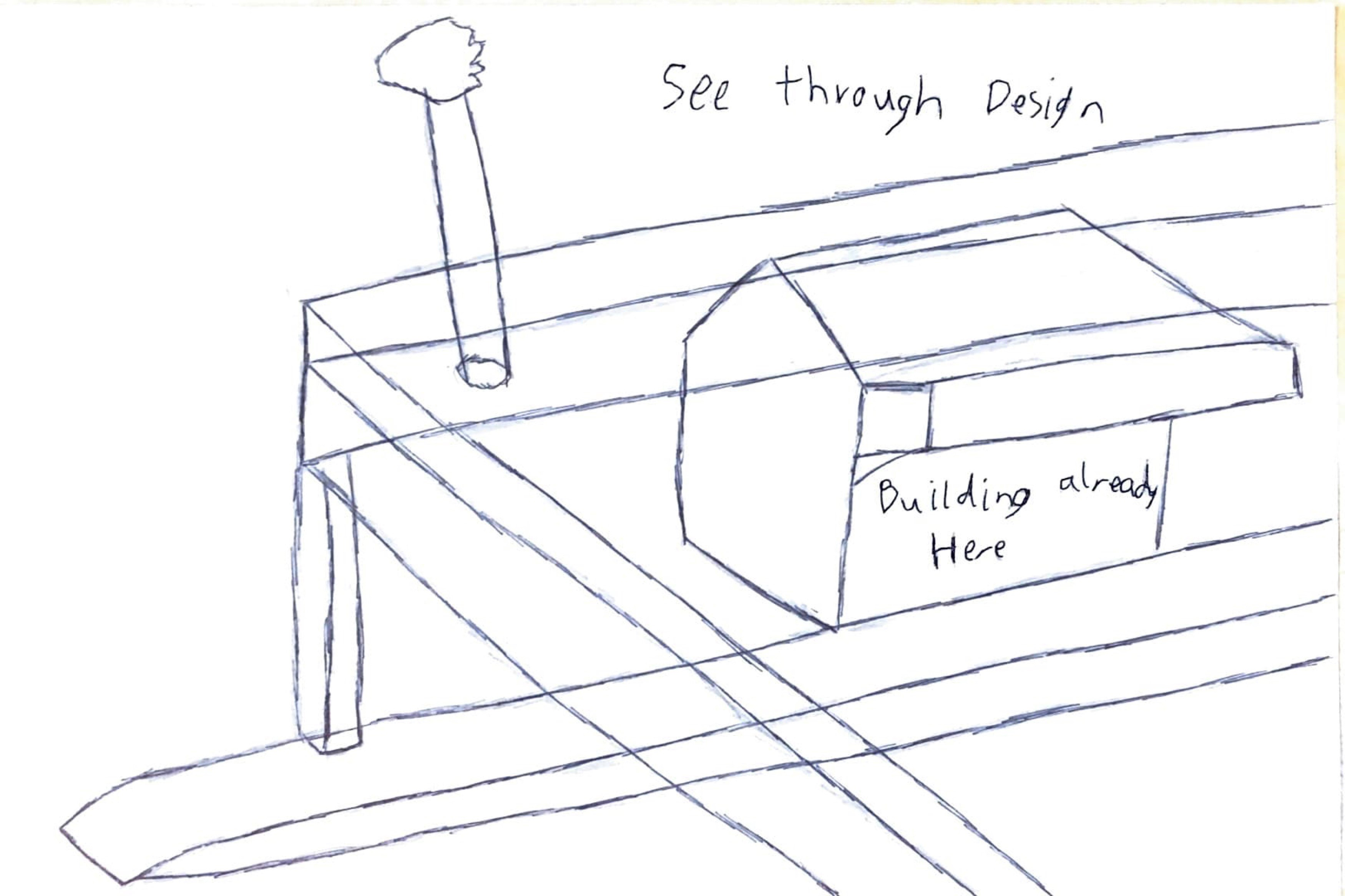
(fig.2.6 - Garden Roof - See Through)
(fig.2.7 - Garden Roof - Second Design - Side)
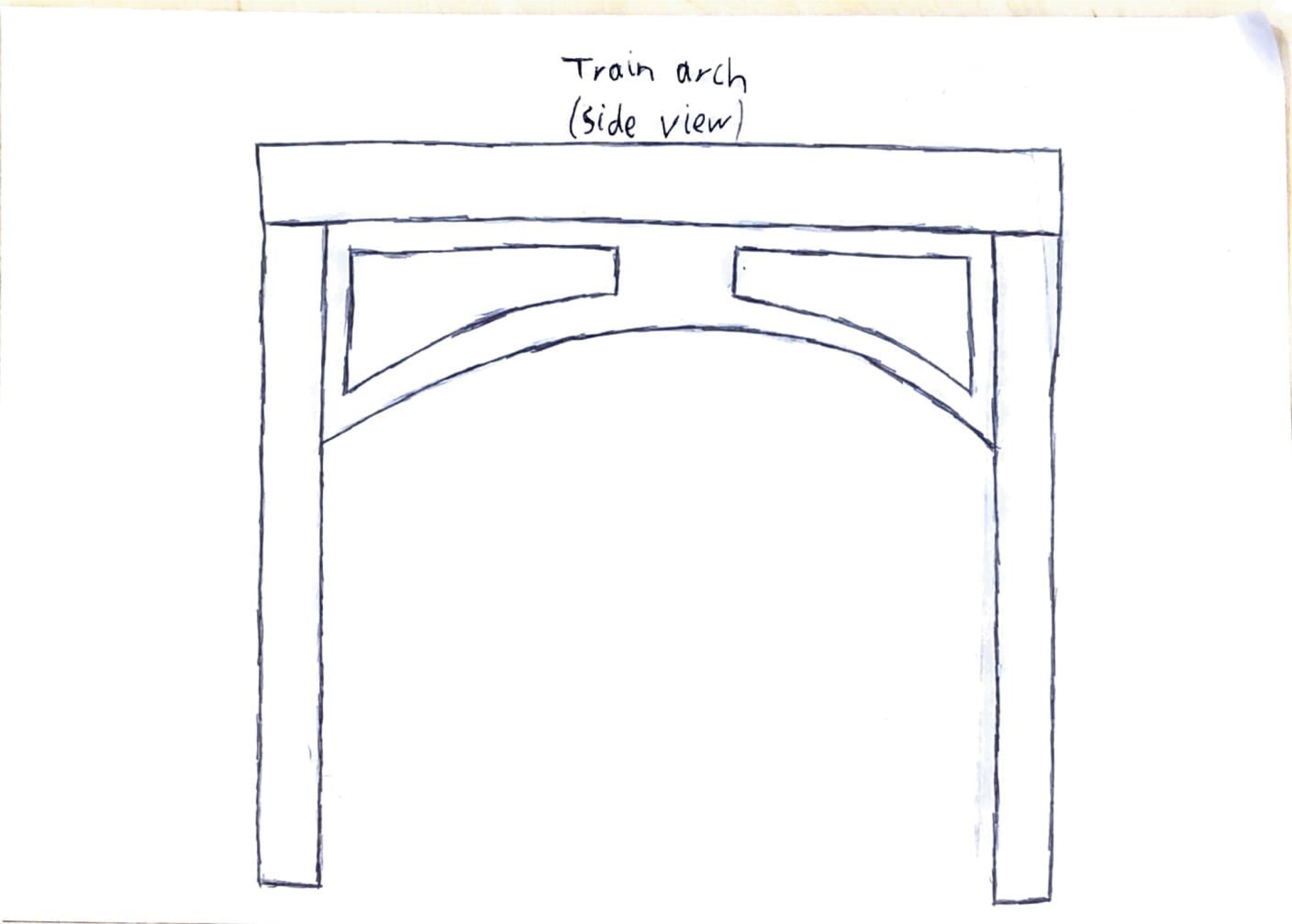
(fig.2.8 - Garden Roof - Second Design - Train Entrance)
(fig.2.9 - Garden Roof - Second Design - Top)
For the inspiration for the design of the roof I researched other structures which feature a "living green" element. Heatherwick Bridge was a plan that was unfortunately scrapped in 2019 due to land ownership issues. The Singapore building is an iconic landmark. I also considered whether art work or a mural would enhance the station along the lines of the Portsmouth mural, as anecdotally the station had been more attractive in the past, with floral displays. See photos below.
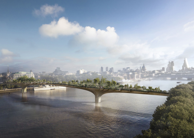
(fig.2.10 - Thomas Heatherwick, Garden Bridge)
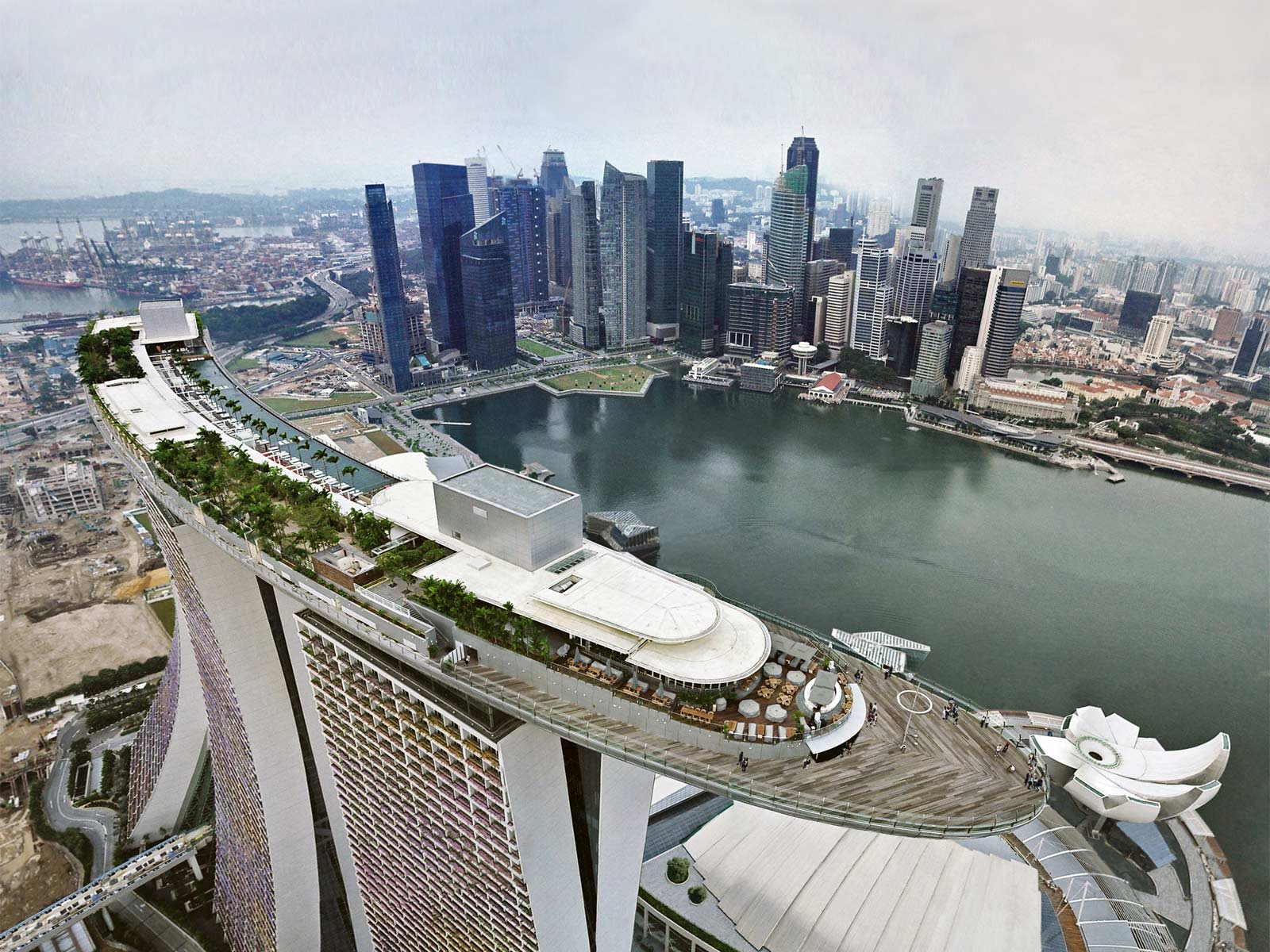
(fig.2.11 - Marina Bay Sands, Singapore)
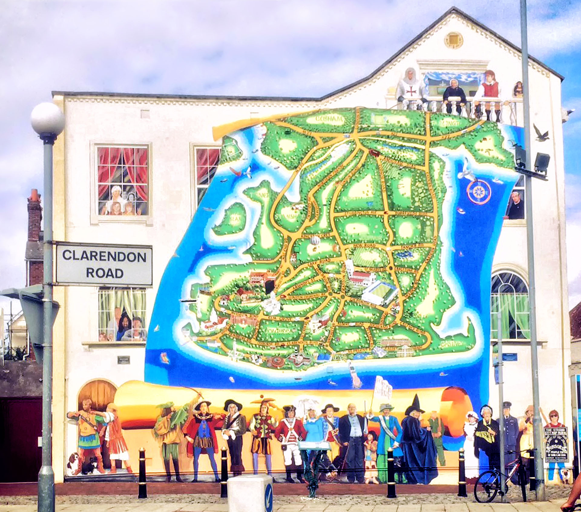
(fig.2.12 - Portsmouth Mural Map)
I tried to make the living roof idea feasible for the brief but I became aware that this would be too ambitious and would have pragmatic issues with overhead lines. I decided that I would redesign based on the results of the survey and a return visit to the station to reassess the available space.
I designed surveys to help me revisit the brief with new ideas based on the local community feedback. This provided the primary data which I analysed to reflect in my re-design. The relevant questions and answers for this project are shown below.
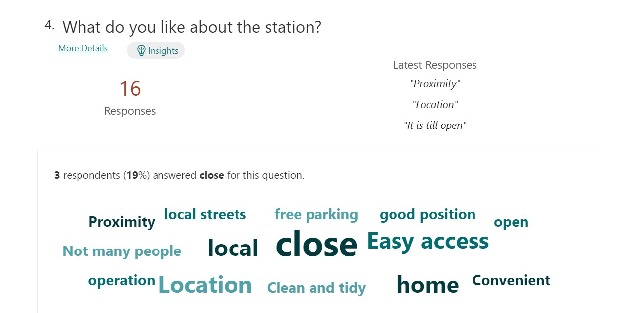
(fig.3.1 - What do they like about the station?)
.jpg)
(fig.3.2 - What do they dislike about the station?)
.jpg)
(fig.3.3 - The reason for the visits)
.jpg)
(fig.3.4 - What would they like at the station?)
.jpg)
(fig.3.5 - Other suggestions for the station)
.jpg)
(fig.3.6 - Do they think the improvements will increase visitor appeal)
.jpg)
(fig.3.7 - Would the community use the facilities at the station)
Overall, the findings from the survey showed that people appreciated the convenience of having a local station, but the biggest dislike was the lack of shelter. The station was used mostly for travel for leisure. This may be related to the older age group of the local demographic but this would need further investigation. The facilities that they wanted most in the future were a toilet, cafe and waiting room. This fed into my design as described in section 5 below. Finally, while respondents to the survey thought they would use community facilities at a station, they did not feel that this would attract visitors to the Kirby Cross area.
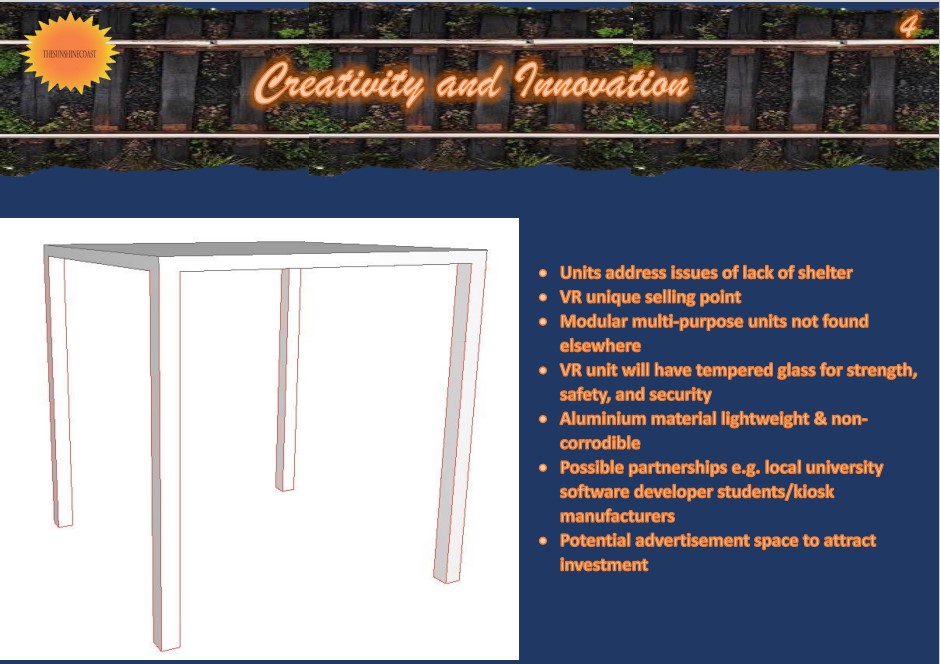
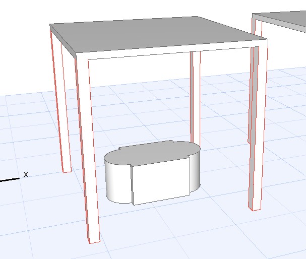
After getting my surveys from the Kirby Cross Facebook community, the responses showed that the community top three prefered facilities are toilets, a cafe and a waiting room. Thinking of what would bring more people to the station I decided to choose the cafe and the waiting room to design. There is a local church group that request donations for the homeless community run by hope@trinity who may want a charity bin in the area, this would be accommodated with the cafe design. I have also incorporated a VR stand. The intention of this is to develop an interest in the area, to bring in other commuters to the station as it would be a unique feature not available at other stations and would offer another facility for the community. After re-inspection of the station site and the limitations of the available space, I developed a unit design that could be adapted to meet multiple uses. See photos below showing:
A garden shed used as a bar;
These all provided ideas for my final design, along with the survey results.
Station photos:
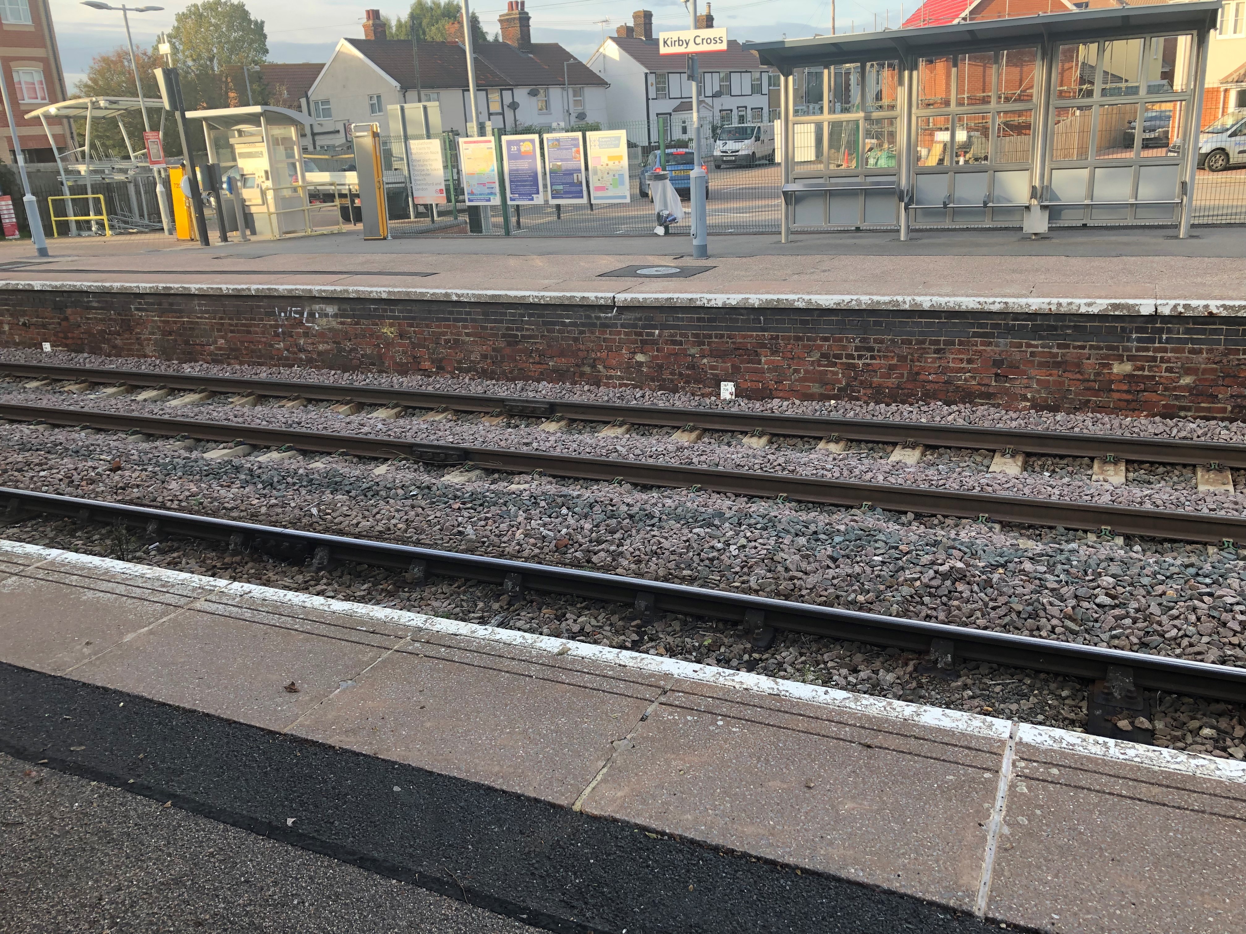
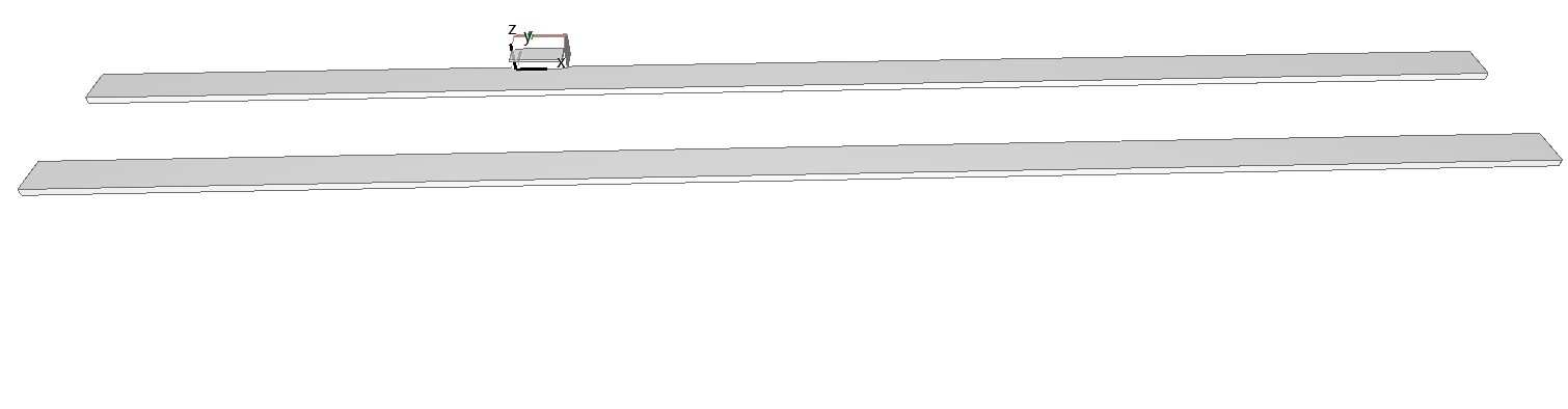
(fig.4.1 - location of the build - platform left side)
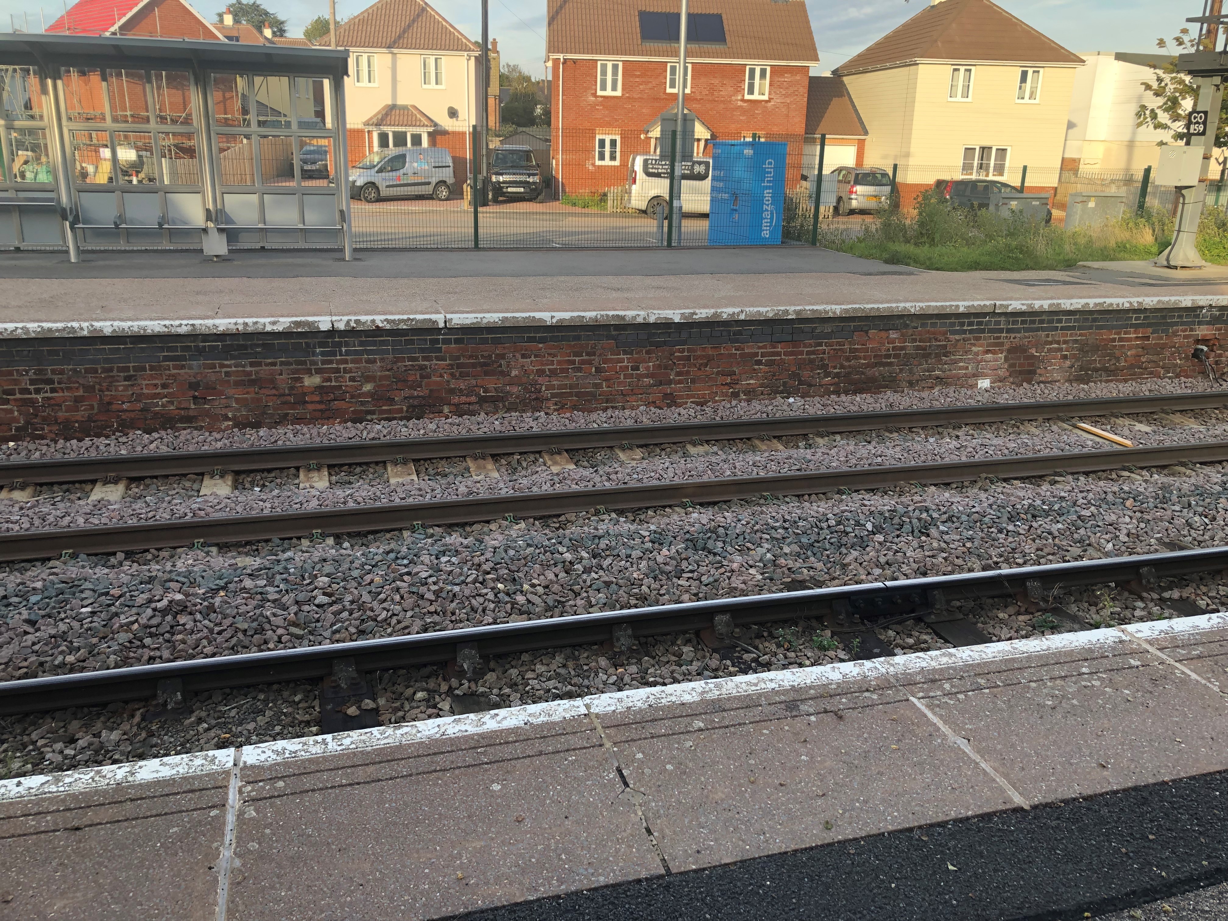
(fig.4.2 - location of the build - platform right side)
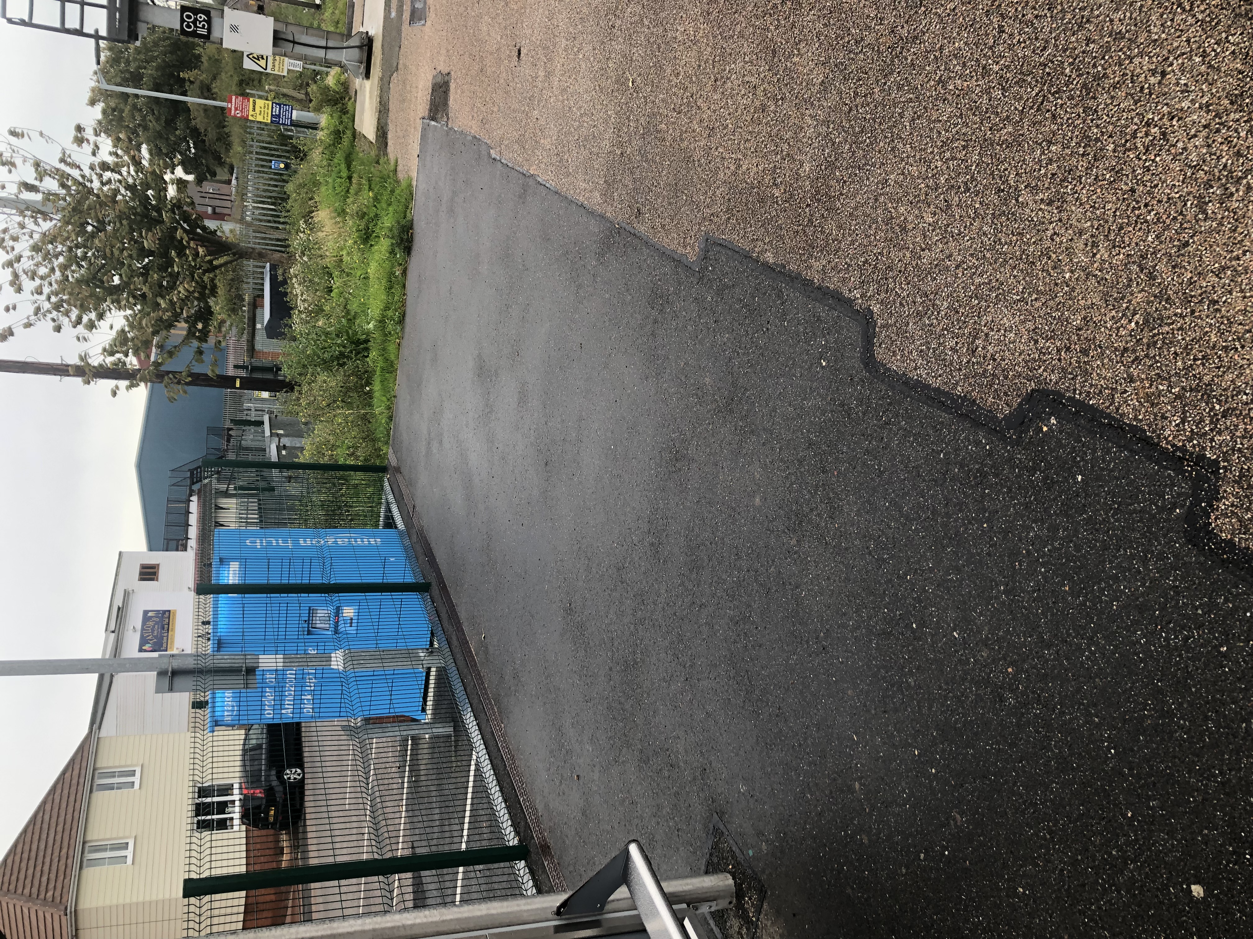
(fig.4.3 - location of the build)
The black tarmac is my preferred area to place the designed units.
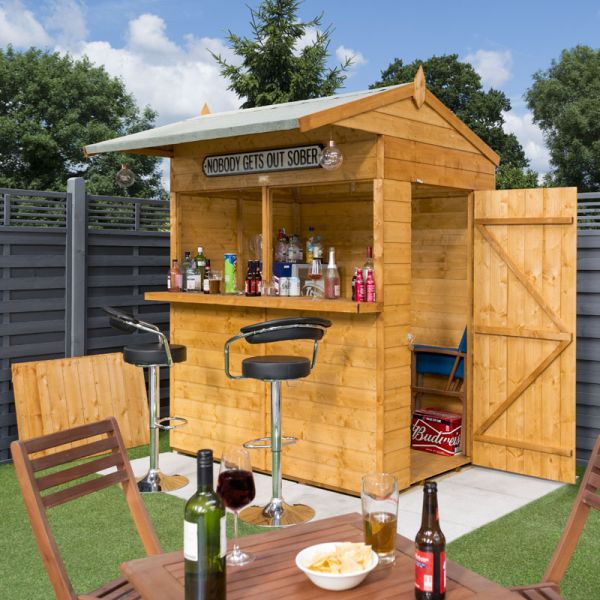
(fig.4.4 - Garden Bar)
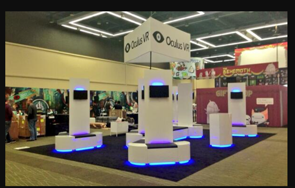
(fig.4.5 - Oculus VR)
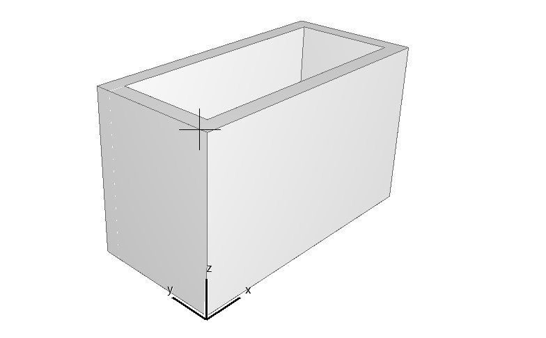
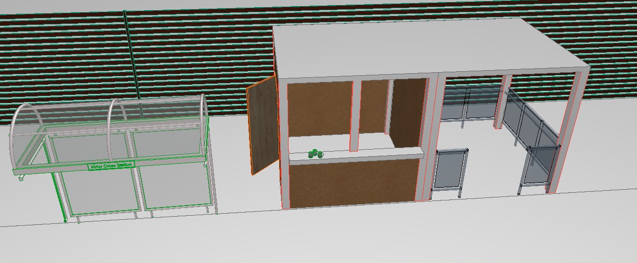
The models below show my emerging design for a multi-purpose unit.
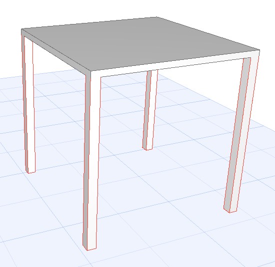
(fig.4.6 - The structure in 3D)
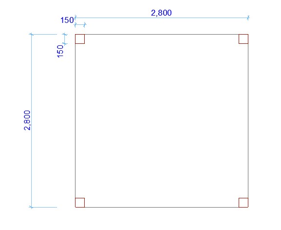
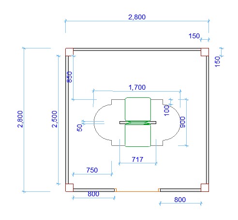
(fig.4.7 - The structure in 2D with dimensions)
This is the model I will be working with, the dimensions I was given from the brief are an area of 2.8m to 2.8m to place my proposed model on.
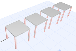
(fig.4.8 - The number of sturctures I made)
Here is an overview of all four models I have made:
(fig.4.9-4.11 - 2D drawings for the VR set)
For the first design, I chose to do the VR room, starting with the stand with the measurement of 1000mm x 700mm (figure 4.9).
Once the stand was made I added arcs to the sides of the piece with the measurement of 350mm (figure 4.10).
After this my lecturer notice that the piece was small to have multiple people, she then suggested offsetting the piece by 100 outwards and then offset the arches by 100 inwards to give it a unique design. After this, I moved the model up for the door (figure 4.11.)
(fig.4.12, 4.13 - 3D model and the panel for the screen)
After Extruding the stand (figure 4.12) I added a panel for the tv screens for the VR set, tried out the materials as well with help from the lecturer. (figure 4.13)
(fig.4.14-4.16 – added the cushion to sit, the screen to view what the user is seeing and then mirrored)
I placed a cushion on there to show the user where to sit (figure 4.14).
Then I placed a screen to show what the user is seeing (figure 4.15).
The cushion and the screen are mirrored to make it have multiple users(figure 4.16).
(fig.4.17, 4.18 - added the walls and added the door to enter the unit)
For the walls I will use clear tempered glass to allow the community to see what is being shown on the screen (figure 4.17).
There will be a glass door to allow entry and exit (figure 4.18).
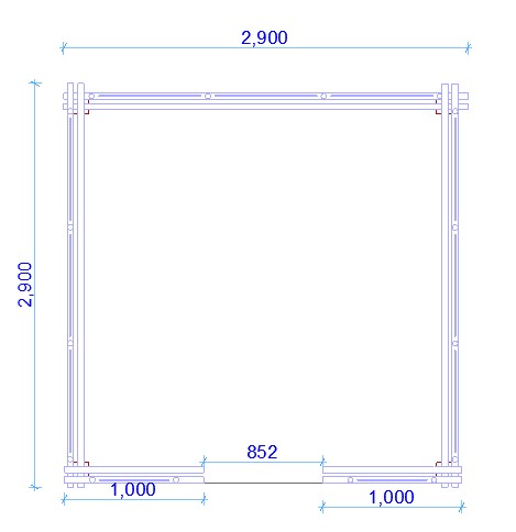
(fig.4.19-4.21 - The Waiting Room)
This will be the waiting room, the start of this is placing a railing on one side and adjusting it to be able to fit in the required space (figure 4.19).
Once I had the look and measurements, I repeated the process on two sides (figure 4.20)
After finishing the outer edges I have made the entrance to the room by just lowering the bars to be just short of the columns (figure 4.21).
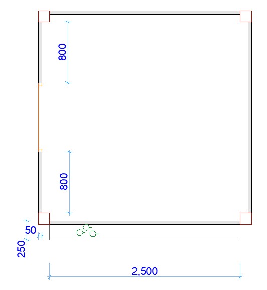
(fig.4.22-4.24 The kiosk for refreshments first half)
Once the waiting room is completed, I moved onto the kiosk, the start of this is the counter, by thinking of a height of an average human I had made the height 1.25m (1250mm) (figure 4.22).
Once the counter wall was made covered the rest of the sides which walls (figure 4.23).
There will be a side door for the owner to enter/exit the kiosk (figure 4.24).
(fig.4.25-4.27 - The kiosk for refreshments second half)
Once the building was designed, I moved back to the counter and placed a top on it, the wall as going through it so it was lowered to 1.15m (1150mm) (figure 4.25).
To finish this model, I added a post in the middle to help indicate where the boards will be placed for when this shut (figure 4.26).
To show that this is suppose to serve refreshments, I added mugs to the counter (figure 4.27).
(fig.4.28, 4.29 - what the kiosk will look like closed)
This the same layout as the cafe but for this one will show what it will look like when closed (figure 4.28).
As is shown, the one on the left is what it will look like when open while the one is when it is closed (figure 4.29).
Here are the dimensions for the different models.
(fig.4.30 - The VR Room)
(fig.4.31 - The Waiting Room)
(fig.4.32 - The Kiosk Room)
I developed a logo to represent this project. I wanted to keep it to the main theme connecting it to the local area. My first design was based on Kirby Cross itself but then I decided to reflect the actual railway line, which is called "Sunshine Coast Line". This led me to consider the rising sun with the words underneath but finalised the logo with a yellow/orange full sun with black writing. See sketches below that led to the final logo.
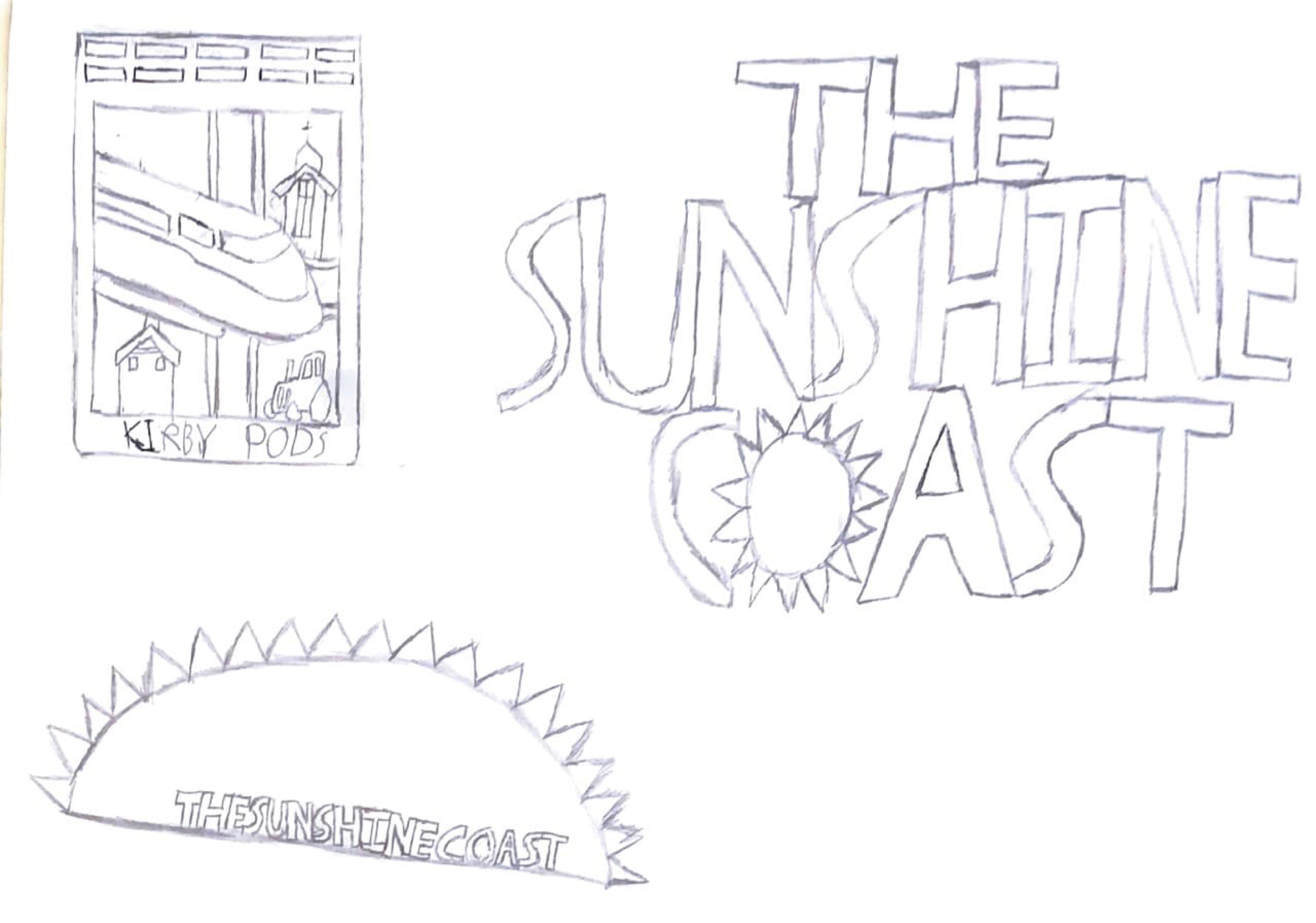
(fig.4.33 - The Sketches for the Logo)
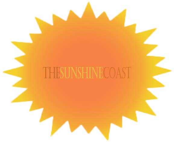
(fig.4.34 - The Final Result)
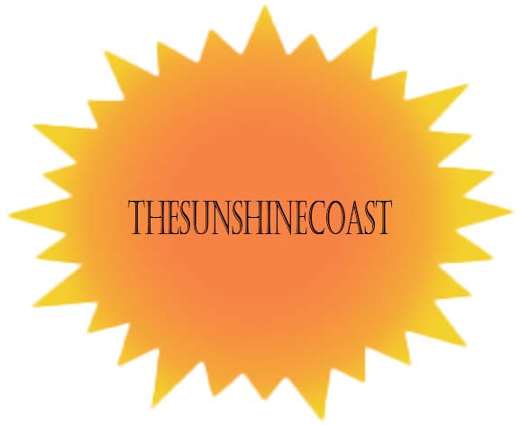
(fig.4.35 - The Final Result with Black Font)
While this was happening, I was creating a design of the station in order to place the models. This was based on google maps and photos taken from the station. The station design was started before the models were finalised. This was also on ArchiCAD, but this model will not be the same as it would look like in real life, but this is for showing how it would look like with the units.
I started with the building on the station and then the platforms. This was done by searching the width of a train carriage, timings it by 2 with a 1m gap in between them and by using the grid finder reference website to measure the length and width of the platforms.
(fig.4.36 - The Walls of the Building)
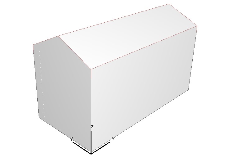
(fig.4.37 - The Roof Added)
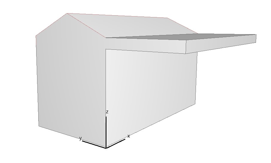
(fig.4.38 - The Cover Added)
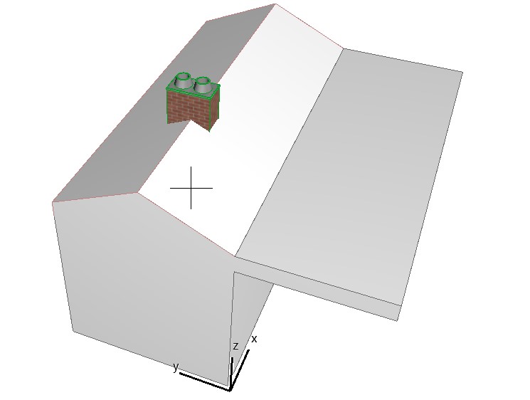
(fig.4.39 - Chimney Added)
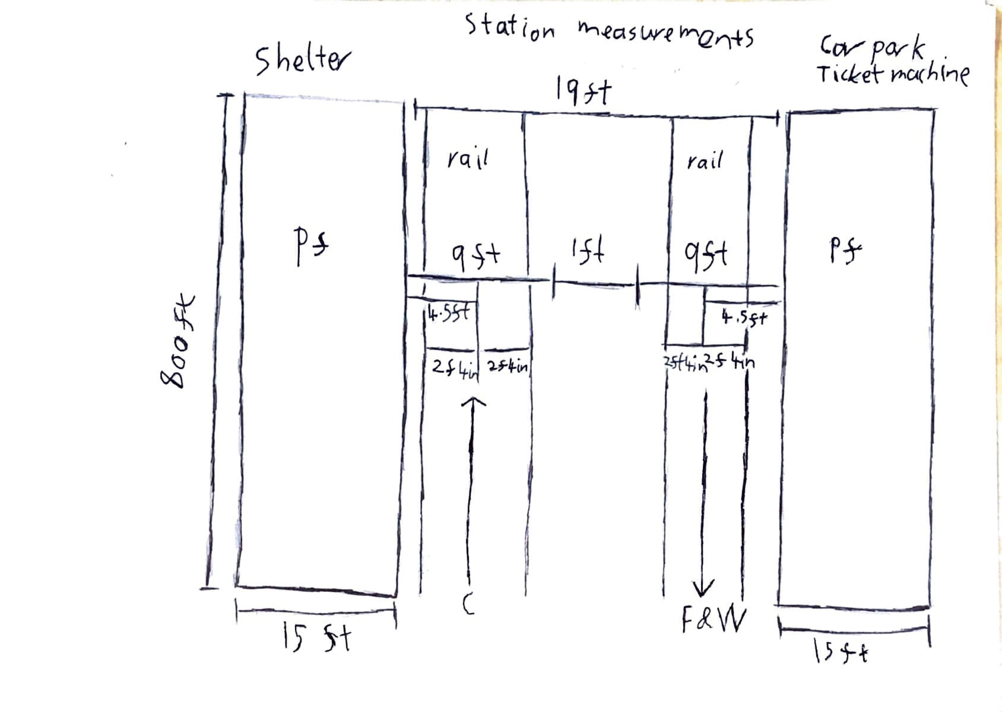
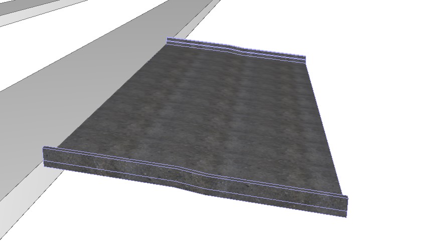
(fig.4.40 - Platform Measurements)
(fig.4.41 - The Platform)
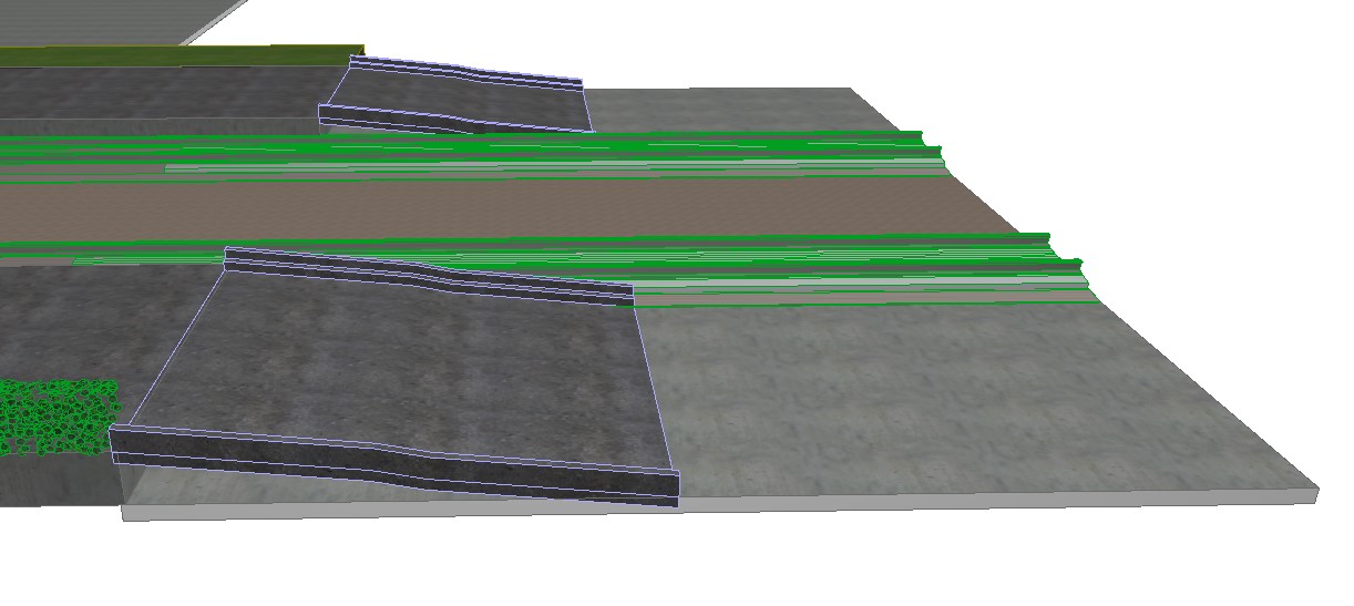
Once the platforms were done, I added the ramps to the model.
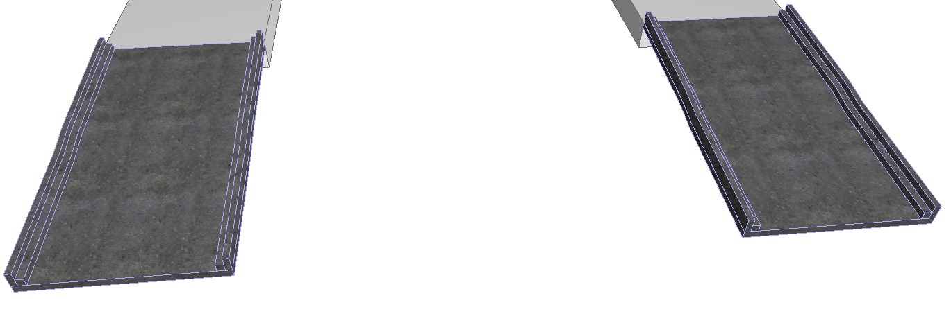
(fig.4.42 - Platform Ramps)
(fig.4.43 - The Car Park Ramp)
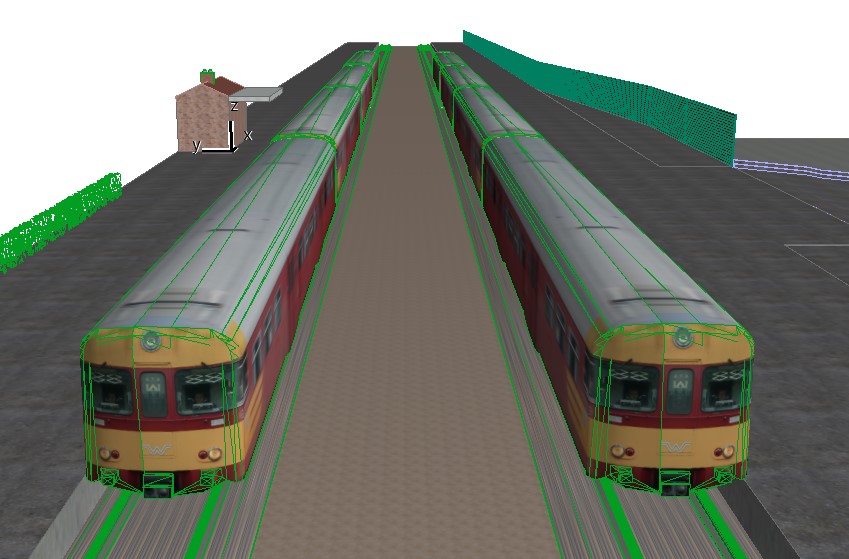
The next bit was to add the trains and the tracks. This was done by using BIM Object for the tracks and the objects tool on the ArchiCAD for the trains.
(fig.4.44 - The Tracks)
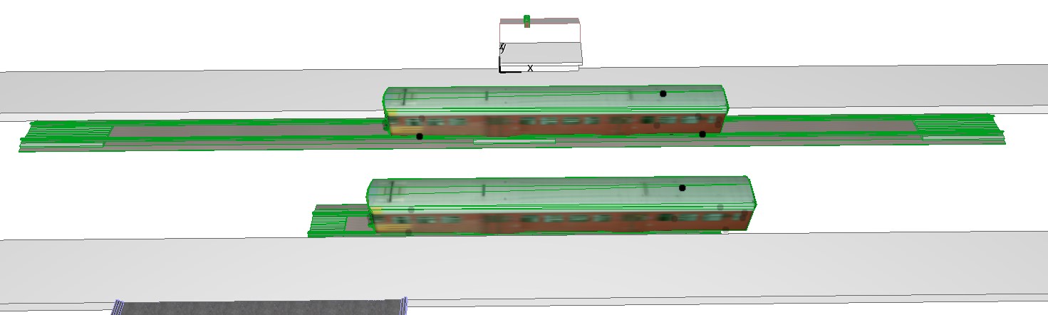
(fig.4.45 - The Trains)
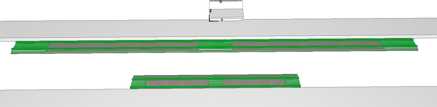
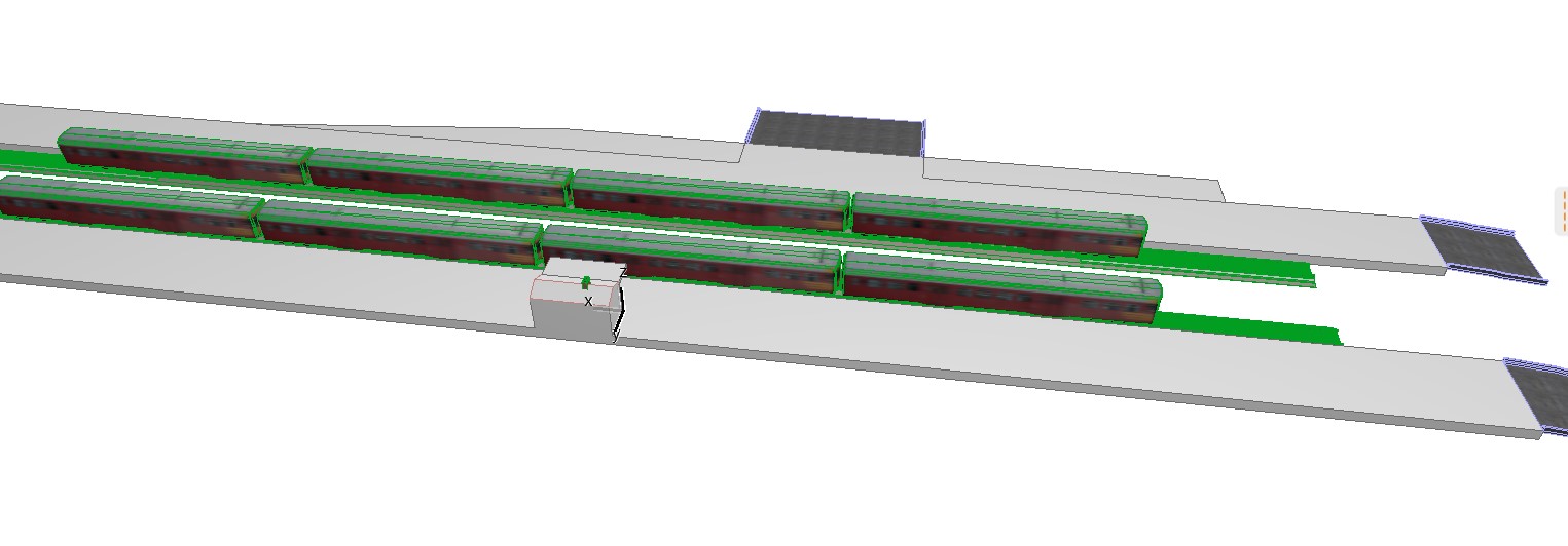
The next part of this was the car park, the fencing, and the mesh of grass. The fencing will not be the same as it is in real life and the car park will not be finished as its the unit that is important to place rather than having a fully complete station. I have also expanded the platform. If there was more time, then more detail would have been added to the station modelling.
(fig.4.46 - The Changes to the Platform, Tracks and, Trains)
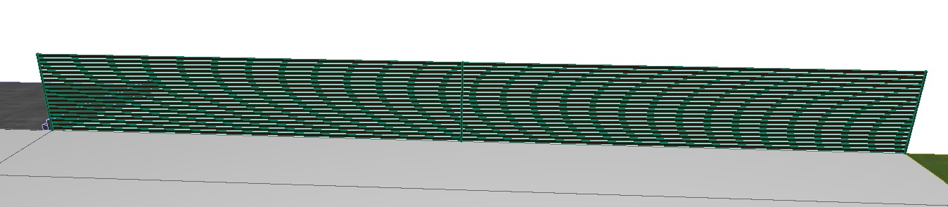
(fig.4.47 - The Fence)
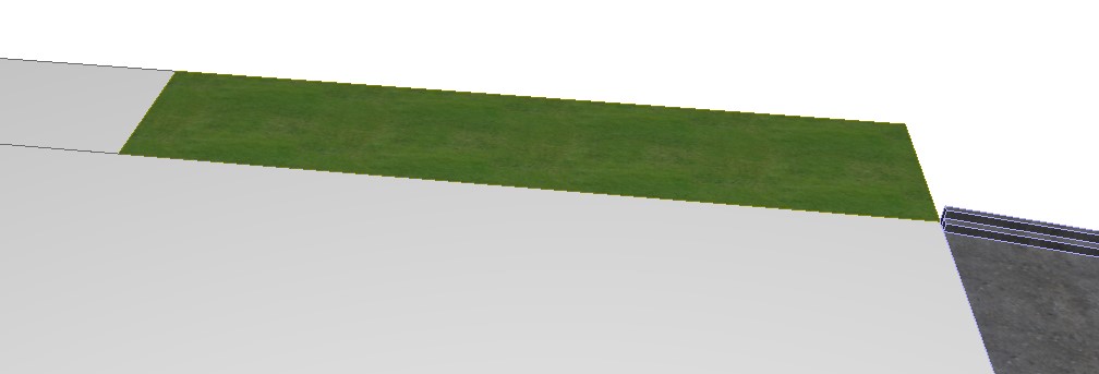
(fig.4.48 - The Mesh Grass)
(fig.4.49 - The Car Park)
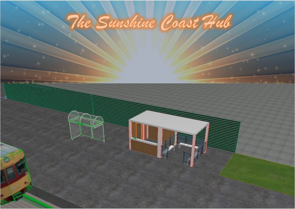
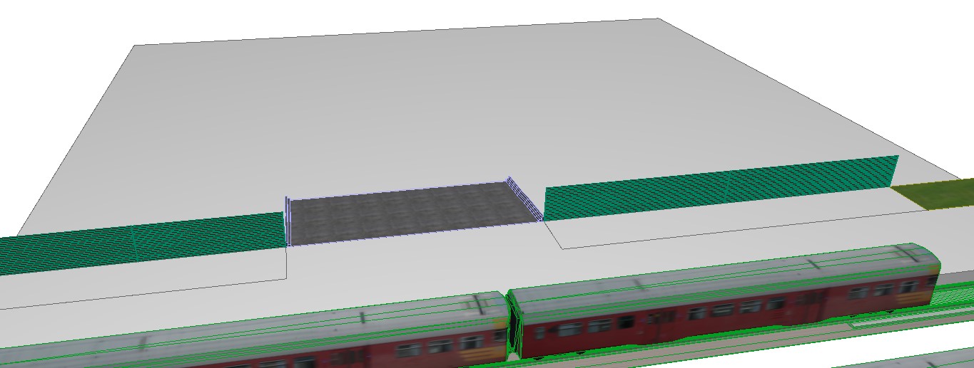
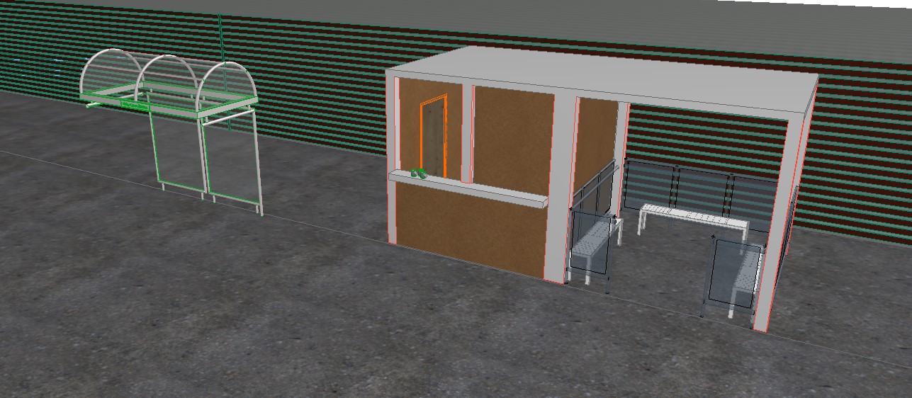
Once I was satisfied with the units, I placed them on the model to where I wanted them to go when I went to the station, to help indicate this I placed a shelter that is already there.
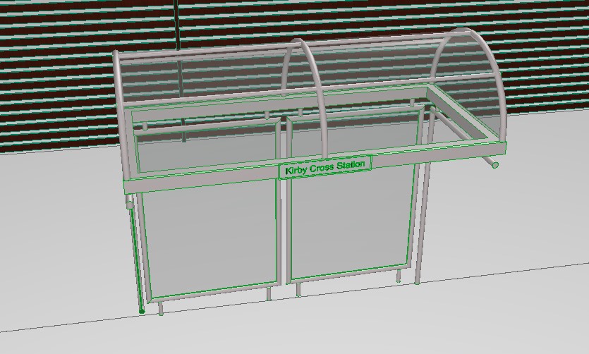
(fig.4.50 - The Shelter)
(fig.4.51 - The Units on the Platform)
With no time to perfect the model and get it to the vision I wanted, I rendered all of the models besides from the units and added the last detail of the ground under the tracks.
(fig.4.52 - The Added Pieces and Rendered finish)
(fig.4.53 - The Rendered Finish - Units)
(fig.4.54 - The Rendered Finish - The Platform)
In summary, there were time constraints that were unforeseen. Some of them were self-made through changing ideas halfway through the semester and inexperience with the software. I also had to manage various external interferences.
However, I still enjoyed aspects of the challenge of this project although these constraints enforced simplicity of design. In the end, this generated a central adaptable idea that could meet many of the needs reflected on the survey in a unique way not offered at any other local station, particularly with the provision of VR. If I had the opportunity, I would fully cost the build, equipment and running costs to assess the sustainability of the model as part of a business plan.
This project will not be finished, I hope to look back on this in the future but for the submission for the RSA deadline, I do not see that possibility happening with semester two work that will be given. I have however attempted to complete the RSA submission requirements by creating the 6 boards that feature the solution I am purposing. These will be shown below:
.png)
.png)
.png)
.png)
.png)
.png)
.png)
.png)
.png)
.png)
.png)
.png)
.png)
.png)
.png)
.png)
.png)
.png)
.png)
.png)